5 Case studies
In this chapter, we bring together the concepts introduced in the previous chapters, ranging from exploratory analysis to spatial prediction, through a series of case studies. Each case study provides a complete workflow, showing how the different stages of a geostatistical analysis fit together in practice. Some of these case studies are designed primarily to consolidate earlier material, while others also introduce new concepts and additional functionalities of the RiskMap package that extend beyond the basics.
5.1 Mapping stunting and underwieght risk in Ghana
Malnutrition remains a critical public health issue in many low- and middle-income countries, particularly affecting children under five years of age. It can have long-term consequences on physical growth, cognitive development, and susceptibility to disease. Monitoring childhood nutritional status is essential for evaluating the effectiveness of health interventions and informing policy decisions.
Two widely used anthropometric indicators derived from child growth measurements are:
Height-for-Age Z-score (HAZ): A measure of stunting, which reflects chronic malnutrition. Children with a HAZ below -2 standard deviations from the WHO growth reference median are considered stunted, indicating long-term nutritional deprivation or repeated infections.
Weight-for-Age Z-score (WAZ): A composite indicator of underweight, capturing both acute and chronic malnutrition. Children with WAZ below -2 are considered underweight. This measure is commonly used in population-based surveys because it is relatively easy to collect and interpret.
These Z-scores are calculated by comparing individual anthropometric measurements to the WHO Child Growth Standards, which were developed based on data from healthy children under optimal environmental and nutritional conditions (WHO 2006).
Geostatistical models applied to HAZ and WAZ, or to the prevalence of stunting and underweight derived from these scores, can help answer critical questions such as: Where is the burden of malnutrition highest? How does it relate to socioeconomic or environmental factors? And which areas should be prioritized for targeted nutritional interventions?
In this case study, we analyse HAZ and WAZ as continuous outcomes to assess the spatial variation in child malnutrition across Ghana and its association with socioeconomic and demographic covariates.
5.1.1 Exploratory analysis
We begin by loading the necessary R packages and the malnutrition dataset. This geostatistical dataset is derived from the 2014 Ghana Demographic and Health Survey (DHS) (Ghana Statistical Service, Ghana Health Service, and ICF International 2015), which provides nationally representative data on child health and nutrition. The dataset includes anthropometric measurements, household characteristics, and georeferenced sampling cluster coordinates, making it suitable for spatial analysis of child malnutrition.
The explanatory variables considered in this analysis are age and wealth. Figure Figure 5.1 displays scatterplots of the two nutritional outcomes (HAZ and WAZ) against age, alongside boxplots stratified by the three levels of the wealth variable.
To explore the relationship between age and nutritional status, the code below applies locally estimated scatterplot smoothing (LOESS) to highlight potential non-linear trends. In addition, we fit linear splines using the function pmax() to model a change in slope at specified knots—2 months for HAZ and 1 month for WAZ. These change points were selected heuristically based on visual inspection of the LOESS curves.
As shown in Figure Figure 5.1, the linear splines (green dashed lines) closely follow the LOESS fits (solid red lines), indicating that the piecewise linear models provide an adequate approximation of the age-nutrition relationship.
# Filter complete cases for relevant variables
mal <- malnutrition %>%
  filter(!is.na(HAZ), !is.na(WAZ), !is.na(age), !is.na(wealth))

# Fit spline model for HAZ with knot at 2 months
mod_haz <- lm(HAZ ~ age + pmax(age - 2, 0), data = mal)

# Fit spline model for WAZ with knot at 1 month
mod_waz <- lm(WAZ ~ age + pmax(age - 1, 0), data = mal)

# Prediction grid for HAZ
newdat_haz <- data.frame(age = seq(min(mal$age), max(mal$age), length.out = 200))
newdat_haz$fit <- predict(mod_haz, newdata = newdat_haz)

# Prediction grid for WAZ
newdat_waz <- data.frame(age = seq(min(mal$age), max(mal$age), length.out = 200))
newdat_waz$fit <- predict(mod_waz, newdata = newdat_waz)

# Plot HAZ vs Age
p1 <- ggplot(mal, aes(x = age, y = HAZ)) +
  geom_point(alpha = 0.3) +
  geom_smooth(method = "loess", colour = "red", se = FALSE) +
  geom_line(data = newdat_haz, aes(x = age, y = fit),
            colour = "green", linetype = "dashed", linewidth = 1.2) +
  labs(title = "HAZ vs Age", x = "Age (months)", y = "HAZ") +
  theme_minimal()

# Plot WAZ vs Age
p2 <- ggplot(mal, aes(x = age, y = WAZ)) +
  geom_point(alpha = 0.3) +
  geom_smooth(method = "loess", colour = "red", se = FALSE) +
  geom_line(data = newdat_waz, aes(x = age, y = fit),
            colour = "green", linetype = "dashed", linewidth = 1.2) +
  labs(title = "WAZ vs Age", x = "Age (months)", y = "WAZ") +
  theme_minimal()

# Boxplots for HAZ and WAZ by wealth
p3 <- ggplot(mal, aes(x = factor(wealth), y = HAZ)) +
  geom_boxplot(fill = "lightblue") +
  labs(title = "HAZ by Wealth Group", x = "Wealth (1 = Poor, 3 = Rich)", y = "HAZ") +
  theme_minimal()

p4 <- ggplot(mal, aes(x = factor(wealth), y = WAZ)) +
  geom_boxplot(fill = "lightgreen") +
  labs(title = "WAZ by Wealth Group", x = "Wealth (1 = Poor, 3 = Rich)", y = "WAZ") +
  theme_minimal()

# Combine plots
(p1 | p2) / (p3 | p4)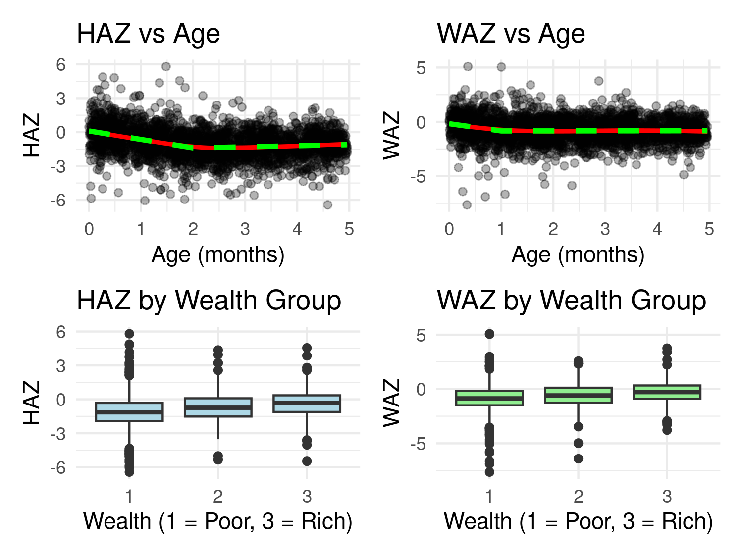
We begin by fitting a non-spatial model to assess whether there is residual spatial correlation that remains after accounting for the effects of age and wealth. Let \(Y_{ij}\) represent either the HAZ or WAZ score for the \(j\)-th child in the \(i\)-th cluster. The model takes the following form:
\[ Y_{ij} = \beta_0 + \beta_1 a_{ij} + \beta_2 \max\{a_{ij} - c, 0\} + \beta_3 w_i + Z_i + U_{ij}, \tag{5.1}\]
where \(a_{ij}\) denotes the age in months of child \(j\) in cluster \(i\), and \(w_i\) is the wealth score associated with cluster \(i\); as previously stated, the change point \(c\) of the linear spline is set to 2 months for HAZ and 1 month for WAZ. The term \(Z_i\) is a Gaussian random effect with mean zero and variance \(\tau^2\), capturing between-cluster variation not explained by the covariates. The error term \(U_{ij}\) represents child-specific residual variation and is assumed to be Gaussian with mean zero and variance \(\omega^2\).
To fit this model, we create a cluster ID variable based on the sampling coordinates and include it as a random intercept in the lmer function to incorporate the term \(Z_i\).
We then fit the models using the lmer function.
library(lme4)
haz_lmer <-
lmer(HAZ ~ age + pmax(age - 2, 0) + wealth + (1 | loc_id), data = malnutrition)

summary(haz_lmer)
Linear mixed model fit by REML ['lmerMod']
Formula: HAZ ~ age + pmax(age - 2, 0) + wealth + (1 | loc_id)
Data: malnutrition
REML criterion at convergence: 8593.6
Scaled residuals:
Min 1Q Median 3Q Max
-4.6407 -0.5992 0.0154 0.6098 5.6443
Random effects:
Groups Name Variance Std.Dev.
loc_id (Intercept) 0.06939 0.2634
Residual 1.39362 1.1805
Number of obs: 2671, groups: loc_id, 410
Fixed effects:
Estimate Std. Error t value
(Intercept) -0.39571 0.08170 -4.844
age -0.77185 0.04471 -17.265
pmax(age - 2, 0) 0.88486 0.06698 13.211
wealth 0.38630 0.03611 10.699
Correlation of Fixed Effects:
(Intr) age p(-2,0
age -0.654
pmax(g-2,0) 0.521 -0.932
wealth -0.616 -0.034 0.038waz_lmer <-
lmer(WAZ ~ age + pmax(age - 1, 0) + wealth + (1 | loc_id), data = malnutrition)
summary(waz_lmer)Linear mixed model fit by REML ['lmerMod']
Formula: WAZ ~ age + pmax(age - 1, 0) + wealth + (1 | loc_id)
Data: malnutrition
REML criterion at convergence: 7997.3
Scaled residuals:
Min 1Q Median 3Q Max
-6.5967 -0.5816 0.0098 0.6312 5.7860
Random effects:
Groups Name Variance Std.Dev.
loc_id (Intercept) 0.05625 0.2372
Residual 1.11823 1.0575
Number of obs: 2668, groups: loc_id, 410
Fixed effects:
Estimate Std. Error t value
(Intercept) -0.50444 0.08951 -5.636
age -0.72230 0.09615 -7.512
pmax(age - 1, 0) 0.73510 0.10754 6.835
wealth 0.27359 0.03238 8.450
Correlation of Fixed Effects:
(Intr) age p(-1,0
age -0.765
pmax(g-1,0) 0.716 -0.989
wealth -0.494 -0.036 0.037Of particular interest in the summary of the fitted models above are the estimates of the variances associated with the random effects: \(\tau^2\) for the cluster-level terms \(Z_i\), and \(\omega^2\) for the child-specific residuals \(U_{ij}\). The estimates suggest that \(\omega^2\) is more than twenty times larger than \(\tau^2\), indicating that the majority of the unexplained variation occurs at the individual child level rather than between clusters. This has important implications for interpretation: any subsequent mapping of the prevalence of stunting or underweight should acknowledge the high degree of within-cluster variability as a limitation. In particular, predictions at unsampled locations may be subject to substantial uncertainty driven by this fine-scale heterogeneity.
5.1.2 Assessing residual spatial correlation and model fitting
We next explore the residual spatial correlation through the empirical variogram. Hence, we extract the estimate of the random effects from Equation 5.1 and input these into the s_variogram function that generates the empirical variogram.
# Extract random effects for HAZ and WAZ and combine them
re <- data.frame(
  loc_id = as.numeric(rownames(ranef(haz_lmer)$loc_id)),
  Z_hat_haz = ranef(haz_lmer)$loc_id[,1],
  Z_hat_waz = ranef(waz_lmer)$loc_id[,1]
)

# Extract one row per location with coordinates
loc_coords <- malnutrition %>%
  select(loc_id, lng, lat) %>%
  distinct()

# Merge coordinates into random effects
re <- left_join(re, loc_coords, by = "loc_id")

# Convert to sf and transform into UTM
library(sf)
re <- st_as_sf(re, coords = c("lng","lat"), crs = 4326)
re <- st_transform(re, crs = propose_utm(re))

# Variogram for HAZ
var_haz <- s_variogram(re, "Z_hat_haz", scale_to_km = TRUE,
                       n_permutation = 1000)
var_waz <- s_variogram(re, "Z_hat_waz", scale_to_km = TRUE,
                       n_permutation = 1000)
library(patchwork)

# Create ggplot objects
p_haz <- plot_s_variogram(var_haz, plot_envelope = TRUE) +
  ggtitle("HAZ")

p_waz <- plot_s_variogram(var_waz, plot_envelope = TRUE) +
  ggtitle("WAZ")

p_haz + p_waz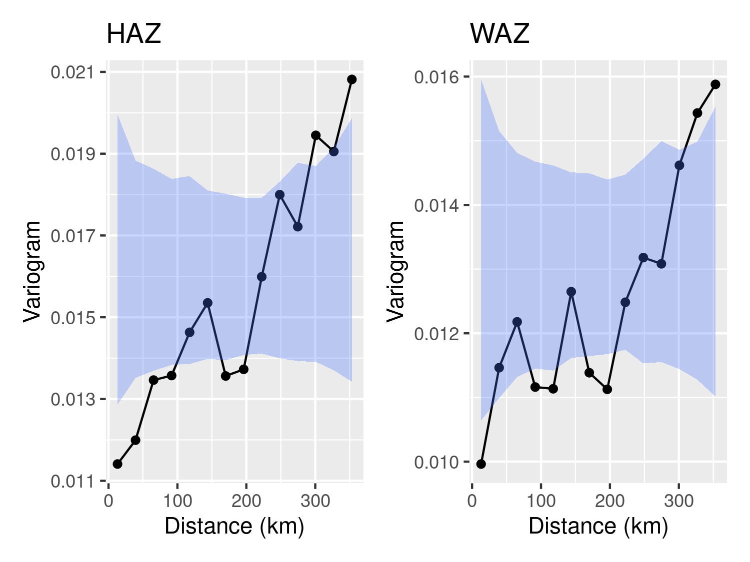
Figure 5.2 shows the variogram for both HAZ and WAZ. In both cases, we observe that is residual spatial correlation in the data that is not explained by either age or the wealth index. We next extend the model in Equation 5.1 to address this issue.
For our geostatistical analysis of HAZ and WAZ, we consider the following model:
\[ Y_{ij} = \beta_0 + \beta_1 a_{ij} + \beta_2 \max\{a_{ij} - c, 0\} + \beta_3 w_i + S(x_i) + U_{ij}, \]
where \(S(x)\) is a zero-mean, stationary, and isotropic Gaussian process with variance \(\sigma^2\) and an exponential correlation function with scale parameter \(\phi\). In this geostatistical extension, we replace the cluster-level random effect \(Z_i\) from Equation 5.1 with the spatial process \(S(x_i)\). The random effect \(Z_i\) was previously used in the Binomial mixed model to account for unexplained variation between clusters. It is also possible to include both \(S(x_i)\) and \(Z_i\) in the model, so that the total unexplained variation between clusters is decomposed into a spatially structured component, \(S(x_i)\), and an unstructured component, \(Z_i\). However, this approach is not recommended in the initial model specification, as it may lead to identifiability issues. It can be considered later in the analysis if justified by model diagnostics.
# Remove missing data from the WAZ outcome
malnutrition <- malnutrition[complete.cases(malnutrition[,"WAZ"]),]

# Converting the data-frame into an sf object
malnutrition_sf <- st_as_sf(malnutrition, coords = c("lng", "lat"), crs = 4326)
malnutrition_sf <- st_transform(malnutrition_sf, crs = propose_utm(malnutrition_sf))

# Maximum likelihood estimation for the HAZ and WAZ outcomes
haz_fit <-
glgpm(HAZ ~ age + pmax(age - 1, 0) + wealth + gp(),
      data=malnutrition_sf, family = "gaussian")

waz_fit <-
  glgpm(HAZ ~ age + pmax(age - 1, 0) + wealth + gp(),
        data=malnutrition_sf, family = "gaussian")
We then summarize the fit of models.
summary(haz_fit)Call:
glgpm(formula = HAZ ~ age + pmax(age - 1, 0) + wealth + gp(),
data = malnutrition_sf, family = "gaussian")
Linear geostatistical model
Link: identity
Inverse link function = x
'Lower limit' and 'Upper limit' are the limits of the 95% confidence level intervals
Regression coefficients
Estimate Lower limit Upper limit StdErr z.value p.value
(Intercept) -0.2158950 -0.4338747 0.0020848 0.1112162 -1.9412 0.05223
age -1.3073560 -1.4135715 -1.2011404 0.0541926 -24.1243 < 2e-16
pmax(age - 1, 0) 1.2288215 1.1496224 1.3080207 0.0404085 30.4100 < 2e-16
wealth 0.3520544 0.3319696 0.3721393 0.0102476 34.3550 < 2e-16
(Intercept) .
age ***
pmax(age - 1, 0) ***
wealth ***
---
Signif. codes: 0 '***' 0.001 '**' 0.01 '*' 0.05 '.' 0.1 ' ' 1
Estimate Lower limit Upper limit
Measuremment error var. 1.4371 1.4254 1.4489
Spatial Gaussian process
Matern covariance parameters (kappa=0.5)
Estimate Lower limit Upper limit
Spatial process var. 0.069453 0.061423 0.0785
Spatial corr. scale 36.529380 30.187727 44.2032
Variance of the nugget effect fixed at 0
Log-likelihood: -1859.246
AIC: 3732.491summary(waz_fit)Call:
glgpm(formula = WAZ ~ age + pmax(age - 1, 0) + wealth + gp(),
data = malnutrition_sf, family = "gaussian")
Linear geostatistical model
Link: identity
Inverse link function = x
'Lower limit' and 'Upper limit' are the limits of the 95% confidence level intervals
Regression coefficients
Estimate Lower limit Upper limit StdErr z.value
(Intercept) -0.4580088 -0.6499668 -0.2660509 0.0979395 -4.6764
age -0.7295504 -0.8235412 -0.6355596 0.0479554 -15.2131
pmax(age - 1, 0) 0.7421647 0.6720850 0.8122443 0.0357556 20.7566
wealth 0.2254477 0.2076797 0.2432157 0.0090655 24.8689
p.value
(Intercept) 2.919e-06 ***
age < 2.2e-16 ***
pmax(age - 1, 0) < 2.2e-16 ***
wealth < 2.2e-16 ***
---
Signif. codes: 0 '***' 0.001 '**' 0.01 '*' 0.05 '.' 0.1 ' ' 1
Estimate Lower limit Upper limit
Measuremment error var. 1.1253 1.1161 1.1346
Spatial Gaussian process
Matern covariance parameters (kappa=0.5)
Estimate Lower limit Upper limit
Spatial process var. 0.049912 0.043750 0.0569
Spatial corr. scale 35.836303 28.815346 44.5679
Variance of the nugget effect fixed at 0
Log-likelihood: -1530.593
AIC: 3075.187The spatial component of the models reveals a moderate degree of spatial structure in the HAZ and WAZ outcomes. For HAZ, the estimated spatial variance is approximately 0.069, while the individual-level radom effect’s variance is substantially larger at around 1.437. For WAZ, the spatial variance is estimated at 0.050, compared to the variance of the individual-level radom effect’s variance of 1.125. In both models, as already observed when fitting Binomial mixed models, this indicates that the majority of the residual variation is due to individual-level noise or unstructured heterogeneity rather than spatially structured effects. The relative contribution of the spatial process to the total unexplained variation is therefore relatively small. Nevertheless, geostatistical analysis remains valuable also in this context. Even when spatial effects explain only a modest proportion of the variation, the model still enables spatial prediction of the average spatial pattern for the outcome of interest across the study area. This is useful for identifying areas where child malnutrition is systematically higher or lower, guiding targeted interventions and informing resource allocation. We explore these implications further in the next section on geostatistical prediction for HAZ and WAZ.
5.1.3 Prediction and assessment of model calibration
Stunting and underweight are standard indicators used to assess child malnutrition. A child is defined as if their height-for-age \(z\)-score (HAZ) is below \(-2\) standard deviations from the median of the WHO Child Growth Standards, i.e., HAZ < -2. Similarly, a child is considered if their weight-for-age \(z\)-score (WAZ) falls below \(-2\), i.e., WAZ < -2 (United Nations Statistics Division, World Health Organization, and UNICEF 2025). These thresholds are based on the World Health Organization (WHO) growth reference standards, which provide a normative basis for assessing nutritional status in children under five years of age (Organization 2024).
We now define the predictive targets for stunting and underweight prevalence in terms of the adopted geostatistical model. Both indicators correspond to the probability that a child’s z-score falls below \(-2\), that is, \(Y(x) < -2\), where \(Y(x)\) denotes either the HAZ or WAZ score at location \(x\). Under the model specification, the prevalence is therefore defined as
\[ T(x) = P\left\{ Y(x) < -2 \,\middle|\, S(x) \right\} = \Phi\left( -\frac{\mu + S(x) + 2}{\omega} \right), \tag{5.2}\]
where \(\Phi(\cdot)\) is the cumulative distribution function of the standard normal distribution, \(\mu\) is the linear predictor including the effects of covariates at individual- and cluster-level (as defined by the coefficients \(\beta_1\) to \(\beta_3\) of Equation 5.1) as well as the intercept, and \(\omega^2\) is the variance of the individual-level residual term. In Equation 5.2, we condition on \(S(x)\) because this allows us to define both stunting an underweight prevalence as a spatially varying predictive target.
To implement this in RiskMap, we begin by generating a predictive grid over the study region. In this case, we use a regular grid with 10 km by 10 km resolution. We then draw predictive samples of the spatial effect \(S(x)\) at each grid location, conditional on the observed data. For the age variable, we fix it at 2 months for HAZ and 1 month for WAZ, respectively. The wealth variable is set to its lowest value of 1. These choices are made to visualize the predictive target for the subgroup of children most at risk of stunting and underweight, as identified through exploratory analysis and the estimated regression coefficients. The code below illustrates this procedure.
# Boundaries of Ghana
library(rgeoboundaries)
ghana <- geoboundaries(country = "Ghana", adm_lvl = "adm0")
ghana <- st_transform(ghana, st_crs(malnutrition_sf))

ghana_grid <- create_grid(ghana, spat_res = 10)

n_pred <- nrow(st_coordinates(ghana_grid))

# Prediction of S(x) and covariates effects over the grid for

# HAZ
haz_pred_grid <- pred_over_grid(haz_fit,
                                grid_pred = ghana_grid,
                                predictors = data.frame(
                                  # Setting age to 2 months
                                  age = rep(2, n_pred),
                                  # Setting wealth to 1 (least wealthy)
                                  wealth = rep(1, n_pred)
                                ))
# WAZ
waz_pred_grid <- pred_over_grid(waz_fit,
                                grid_pred = ghana_grid,
                                predictors = data.frame(
                                  # Setting age to 1 month
                                  age = rep(1, n_pred),
                                  # Setting wealth to 1 (least wealthy)
                                  wealth = rep(1, n_pred)
                                ))
We then use the pred_target_grid function to generate predictive summaries of stunting and underweight prevalence, as defined in Equation 5.2. To quantify uncertainty in the predictions, we report the coefficient of variation, which provides a standardized measure of relative uncertainty across the prediction grid.
# Prediction of stunting prevalence
sd_ind_haz <- sqrt(coef(haz_fit)$sigma2_me)
stunting_prev <-
pred_target_grid(haz_pred_grid,
                 f_target = list(prev = function(x) pnorm((-2-x)/sd_ind_haz)),
                 pd_summary = list(mean = mean,
                                       cv = function(x) sd(x)/mean(x)))

# Prediction of underweight prevalence
sd_ind_waz <- sqrt(coef(waz_fit)$sigma2_me)
underw_prev <-
  pred_target_grid(waz_pred_grid,
                   f_target = list(prev = function(x) pnorm((-2-x)/sd_ind_waz)),
                   pd_summary = list(mean = mean,
                                     cv = function(x) sd(x)/mean(x)))
Finally, we visualize the results in the map shown in Figure 5.3. The maps reveal a clear hotspot for both stunting and underweight, with predicted prevalence values reaching approximately \(45\%\) and \(24\%\), respectively. Notably, this same region also exhibits lower predictive uncertaint, measured by the coefficient of variation, compared to other areas in Ghana.
# Set up a 2x2 layout
layout(matrix(1:4, nrow = 2, byrow = TRUE))
par(mar = c(4, 4, 4, 5))  # Adjust margins

# Top row: stunting
plot(stunting_prev, which_target = "prev", which_summary = "mean",
     main = "Stunting: Predictive Mean")
plot(stunting_prev, which_target = "prev", which_summary = "cv",
     main = "Stunting: Coefficient of Variation")

# Bottom row: underweight
plot(underw_prev, which_target = "prev", which_summary = "mean",
     main = "Underweight: Predictive Mean")
plot(underw_prev, which_target = "prev", which_summary = "cv",
     main = "Underweight: Coefficient of Variation")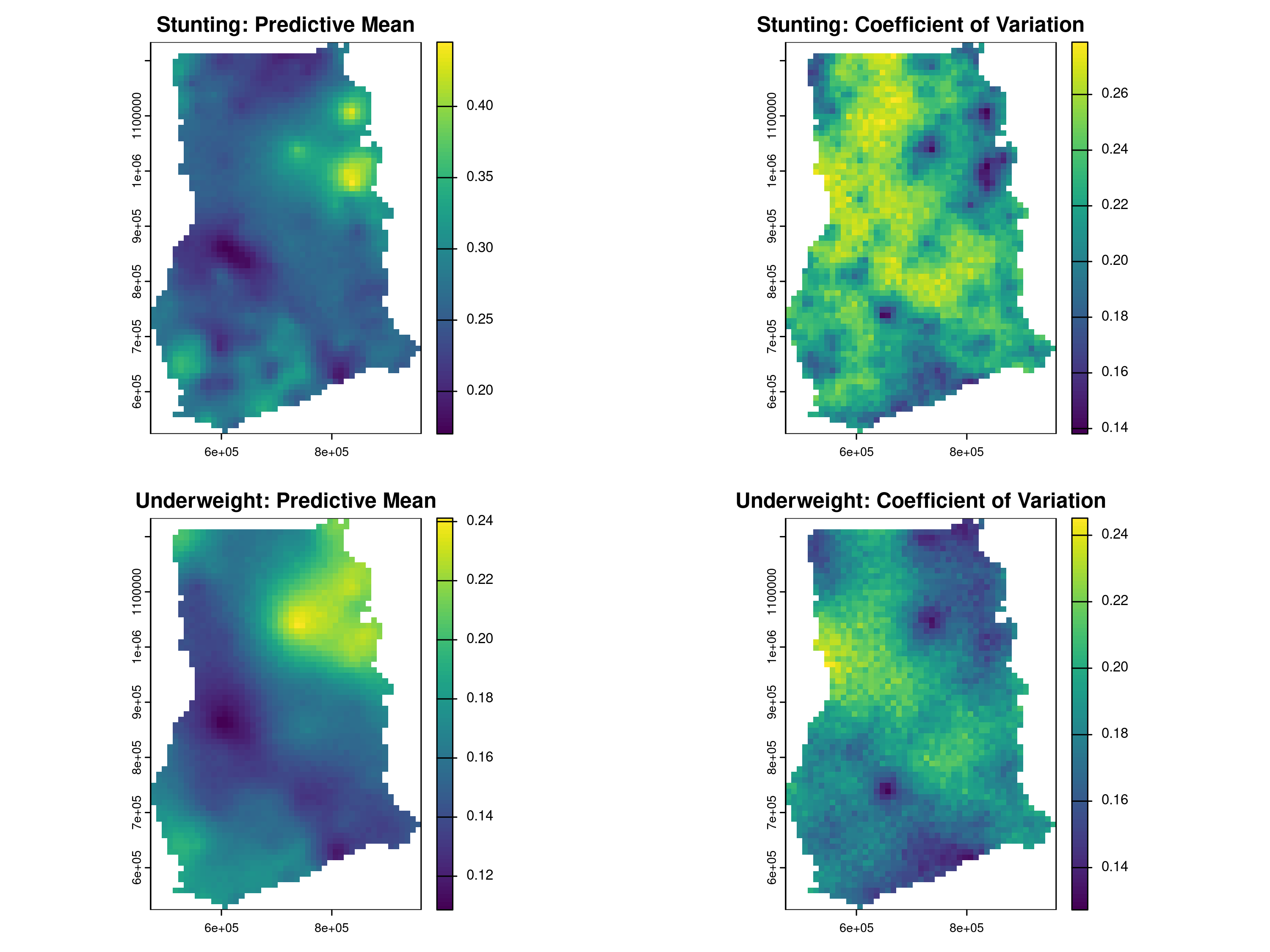
To assess the predictive performance and calibration of our geostatistical models for HAZ and WAZ, we perform a cross-validation exercise using the assess_pp function. Cross-validation is conducted by repeatedly splitting the data into training and testing sets, ensuring that prediction locations are at least 5 km away from the nearest training point. Specifically, we set n_size = 100 prediction locations for the test set, impose a minimum distance constraint of 5 km (min_dist = 5), and repeat the process over 10 test sets randomly drawn under those conditions (iter = 10) using method="regularized" as the sampling method.
We note that for a Gaussian linear geostatistical model, the assess_pp function does not compute the average non-randomized probability integral transform (AnPIT, introduced in Section 4.4.2), as this measure is specifically designed for count outcomes. Instead, it employs the standard probability integral transform (PIT), defined as \(\text{PIT}(y) = F_{M}(y)\), where \(F_{M}(y)\) is the cumulative distribution function of the predictive distribution evaluated at the observed value \(y\). The PIT transforms the observed outcomes in the test set such that, if the model is well-calibrated, these transformed values should follow a uniform distribution. Deviations from uniformity indicate potential issues with calibration and predictive accuracy.
Figure 5.4 shows the results of the cross-validation exercise visualized through PIT curves for HAZ and WAZ. Similarly to the way we have interpreted the AnPIT curves, the PIT curves indicate good calibration when they lie close to the identity line, meaning the predictive distributions accurately reflect the observed variability in the test sets. The results shown in Figure 5.4 demonstrate that, for all ten test sets and for both HAZ and WAZ, the PIT curves closely align with the identity line, confirming that the models are well-calibrated and provide reliable uncertainty quantification.
# Generate PIT plots
p_haz <- plot_AnPIT(assess_haz, mode = "all")
p_waz <- plot_AnPIT(assess_waz, mode = "all")

# Arrange side-by-side
library(gridExtra)
grid.arrange(p_haz, p_waz, ncol = 2)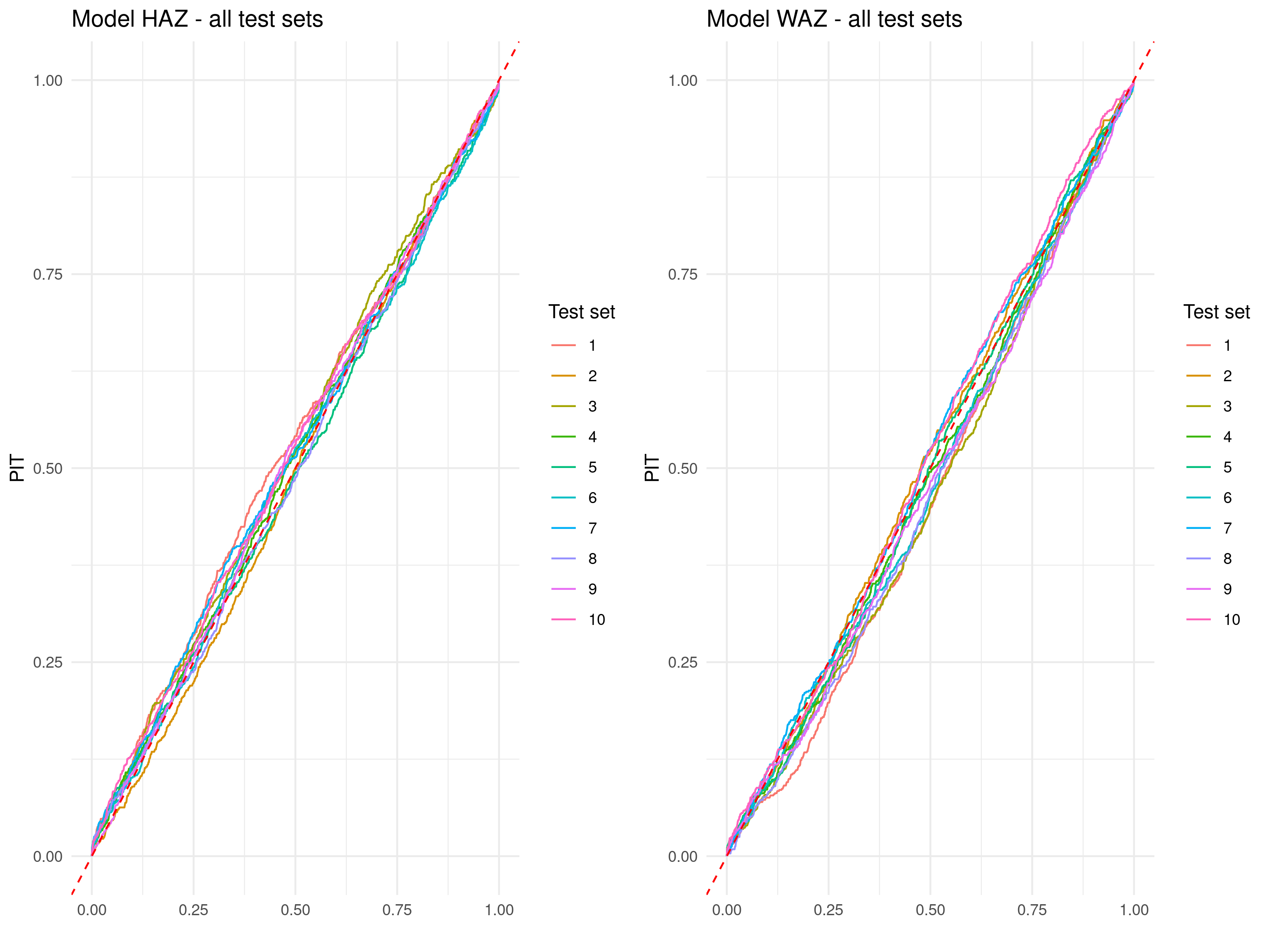
5.1.4 Summary and conclusions
This case study demonstrated the utility of geostatistical modeling for mapping child malnutrition in Ghana using continuous anthropometric measurements, namely HAZ and WAZ Z-scores. By modeling these outcomes directly, we were able to define stunting and underweight prevalence as predictive probabilities based on threshold exceedance (e.g., HAZ < -2), rather than by dichotomizing the data prior to analysis. This approach allowed us to retain the full information content of the measurements and to produce spatially resolved predictions of prevalence along with associated uncertainty estimates. Readers interested in a more in-depth treatment of this modeling strategy are referred to Kyomuhangi et al. (2021), which discusses the loss of information and degradation in predictive performance that can result from dichotomizing continuous outcomes in geostatistical settings.
More broadly, this case study illustrated how geostatistical models can be used to analyze individual-level outcomes while accounting for both child-level and household-level covariates. Aggregation of data across individuals, such as using average HAZ or WAZ scores per location, is not required and can in fact introduce several complications. In particular, the number of children per cluster varies, which implies that an analysis based on cluster-level averages would require a heteroscedastic specification for the residual term to appropriately reflect varying precision across locations. Ignoring this could lead to unreliable predictive inferences.
In conclusion, this analysis showed that neither dichotomization nor aggregation is necessary in geostaistical analysis. Instead, geostatistical models should be fitted to individual-level continuous outcomes, and suitable predictive targets and summaries of uncertainty can then be derived from the fitted model.
5.2 Mapping malaria in Malawi
In this section, we demonstrate how to conduct a geostatistical analysis using Malaria Indicator Survey (MIS) data accessed through the malariaAtlas R package (Lucas et al. 2020). This package provides streamlined access to a curated repository of georeferenced malaria data, including prevalence surveys and associated metadata, making it a valuable resource for spatial epidemiological studies. The primary aim here is to illustrate how relevant environmental covariates can be obtained via Google Earth Engine and incorporated into a geostatistical model for prevalence mapping. Although the analysis is not guided by a specific research question, its value lies in showcasing the full workflow and technical aspects introduced in previous chapters, including data preparation, covariate extraction, exploratory analysis, model fitting, and spatial prediction of disease prevalence.
5.2.1 Downloading prevalence and raster data
This section illustrates how to access and visualize Malaria Indicator Survey data using the malariaAtlas R package, focusing on Plasmodium falciparum prevalence in Malawi for the year 2006. We walk through the steps to extract survey data, obtain country boundaries, and produce a basic map of raw prevalence data.
We begin by loading the necessary packages and initializing the Earth Engine API via the rgee package.
We then use rgeoboundaries to obtain Malawi’s administrative boundary and extract P. falciparum prevalence survey data from the malariaAtlas package for surveys conducted in or overlapping the year 2006.
# Get Malawi boundary
mlw_admin0_sf <- geoboundaries(country = "Malawi", adm_lvl = "adm0")
mlw_admin0_ee <- sf_as_ee(mlw_admin0_sf)
# Download PfPR survey data
mlw_pfpr <- getPR(country = "Malawi", species = "Pf") %>%
filter(year_start <= 2006 & year_end >= 2006) %>%
filter(!is.na(longitude) & !is.na(latitude))
# Convert to sf object
mlw_sf <- st_as_sf(mlw_pfpr, coords = c("longitude", "latitude"), crs = 4326)
# Convert to UTM
mlw_crs <- propose_utm(mlw_sf)
mlw_sf <- st_transform(mlw_sf, crs = mlw_crs)
# Remove columns with all NAs
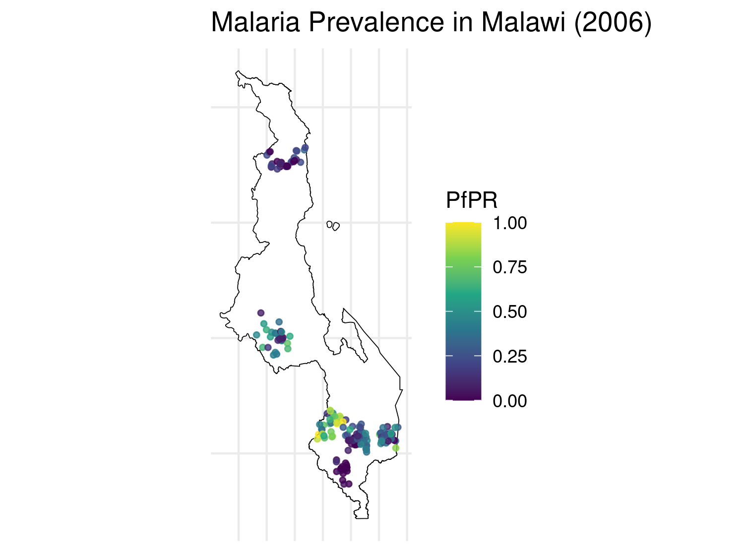
mlw_sf <- mlw_sf[, colSums(!is.na(mlw_sf)) > 0]The following map displays the raw prevalence data at each survey location. The size and color of each point reflect the estimated malaria prevalence (pr) at that location.
# Compute prevalence
# Compute observed prevalence
mlw_sf$pr <- mlw_sf$positive / mlw_sf$examined

# Plot raw PfPR data with uniform point size and no axis labels
ggplot() +
  geom_sf(data = mlw_admin0_sf, fill = "white", color = "black") +
  geom_sf(data = mlw_sf, aes(color = pr), size = 1, alpha = 0.8) +
  scale_color_viridis_c(name = "PfPR") +
  theme_minimal() +
  ggtitle("Malaria Prevalence in Malawi (2006)") +
  theme(
    legend.position = "right",
    axis.title = element_blank(),
    axis.text = element_blank(),
    axis.ticks = element_blank()
  )
In the next step we retrieve a suite of environmental covariates that are mechanistically linked to malaria transmission and therefore commonly included in spatial risk-mapping studies. All layers are clipped to the Malawi national boundary and combined into a single multi-band image ready for extraction at the survey points.
These covariates are summarised in Table Table 5.1, which also explains their epidemiological relevance in the context of malaria transmission.
| Covariate | Source | Processing | Relevance |
|---|---|---|---|
| Precipitation | CHIRPS Daily | Annual mean (mm · day⁻¹) | Determines suitability of breeding sites for Anopheles mosquitoes. |
| Land-surface temperature | MODIS MOD11A2 | Kelvin converted to °C; annual mean | Affects mosquito survival and parasite development rates. |
| NDVI | MODIS MOD13A2 | Scaled to 0–1; annual mean | Proxy for habitat moisture and vegetation cover. |
| Elevation | SRTM DEM | 90 m; clipped to country boundary | Integrates climatic variation; highlands tend to have lower transmission. |
| Relative humidity | ERA5-Land | Derived from temperature and dew-point; annual mean (%) | High humidity increases mosquito survival. |
| Urbanicity (built-up areas) | MODIS MCD12Q1 | Binary indicator (class 13 = urban) | Urban areas generally have lower risk due to infrastructure and fewer breeding sites. |
We point out that in order to compute relative humidity, we first extract hourly estimates of air temperature and dew-point temperature at 2 meters above ground level from the ERA5-Land reanalysis product. These two quantities are then combined using a standard empirical formula derived from the Clausius–Clapeyron relation: \[ \text{RH} = 100 \times \left( \frac{e^{\frac{17.625 \cdot T_d}{243.04 + T_d}}}{e^{\frac{17.625 \cdot T}{243.04 + T}}} \right) \] where \(T_d\) is the dew-point temperature and \(T\) is the air temperature, both in degrees Celsius. This yields the mean annual relative humidity over the target region, expressed as a percentage.
Table 5.1 does not provide an exhaustive list of covariates, and other factors such as soil moisture, land surface water, nighttime temperature, or socio-economic indicators like night-time light intensity and land surface emissivity, which may serve as proxies for human activity, infrastructure, or economic development, could also influence malaria risk. However, to maintain this illustrative analysis simpler, we restrict our attention to a core set of covariates that capture key climatic, ecological, and anthropogenic drivers.
In the code below, all layers are clipped to the boundary of Malawi and combined into a single multi-band image, ready to be extracted at survey point locations for subsequent modeling.
# -------------------------------
# STEP 2: Covariates from Earth Engine
# -------------------------------
scale_m <- 1000

# Precipitation
precip <- ee$ImageCollection("UCSB-CHG/CHIRPS/DAILY")$
  filterDate("2006-01-01", "2006-12-31")$
  mean()$rename("precip")$clip(mlw_admin0_ee)$toFloat()

# Temperature
lst <- ee$ImageCollection("MODIS/061/MOD11A2")$
  filterDate("2006-01-01", "2006-12-31")$
  select("LST_Day_1km")$mean()$
  multiply(0.02)$subtract(273.15)$rename("lst_c")$
  clip(mlw_admin0_ee)$toFloat()

# NDVI
ndvi <- ee$ImageCollection("MODIS/061/MOD13A2")$
  filterDate("2006-01-01", "2006-12-31")$
  select("NDVI")$mean()$
  multiply(0.0001)$rename("ndvi")$
  clip(mlw_admin0_ee)$toFloat()

# Elevation
elev <- ee$Image("USGS/SRTMGL1_003")$
  rename("elev")$clip(mlw_admin0_ee)$toFloat()

# Humidity from ERA5 (computed from dewpoint and temperature)
era5 <- ee$ImageCollection("ECMWF/ERA5_LAND/HOURLY")$
  filterDate("2006-01-01", "2006-12-31")$
  select(c("dewpoint_temperature_2m", "temperature_2m"))$
  mean()$clip(mlw_admin0_ee)

td <- era5$select("dewpoint_temperature_2m")$subtract(273.15)
t <- era5$select("temperature_2m")$subtract(273.15)

rh <- td$expression(
  "100 * (exp((17.625 * TD)/(243.04 + TD)) / exp((17.625 * T)/(243.04 + T)))",
  list(TD = td, T = t)
)$rename("humidity")$toFloat()

# Use MODIS Land Cover, version 061
urban_raw <- ee$ImageCollection("MODIS/061/MCD12Q1")$
  filterDate("2006-01-01", "2006-12-31")$
  first()$select("LC_Type1")$clip(mlw_admin0_ee)

# Urban areas are class 13 in IGBP classification
built_up <- urban_raw$eq(13)$rename("built_up")$toFloat()


# Combine all covariates
covariates <- precip$
  addBands(lst)$
  addBands(ndvi)$
  addBands(elev)$
  addBands(rh)$
  addBands(built_up)
After defining the multi-band raster image covariates in Google Earth Engine, we download it as a GeoTIFF file using the ee_as_rast() function from the rgee package. The file is saved temporarily and clipped to the bounding box of Malawi. We then read the raster into R using the terra.
# -------------------------------
# STEP 3: Download Earth Engine raster
# -------------------------------
out_file <- file.path(tempdir(), "malawi_covariates_2006.tif")
region <- mlw_admin0_ee$geometry()$bounds()

rgee::ee_as_rast(
  image = covariates,
  region = region,
  scale = scale_m,
  dsn = out_file,
  via = "drive"
)

# Load raster
r_covs <- rast(out_file)

# -------------------------------
# STEP 4: Extract covariates at survey locations
# -------------------------------
vals <- terra::extract(r_covs, vect(mlw_sf))
mlw_sf <- bind_cols(mlw_sf, vals[, -1])  # remove ID column
The following code generates six raster maps, one for each covariate, using ggplot2. We first convert the raster stack to a data frame and then create a separate ggplot object for each variable, ensuring a consistent and clean visual style across all maps. The plots in Figure 5.6 are arranged in a 2 × 3 grid using the base grid package.
# 1. Prepare a data frame

r_df <- as.data.frame(r_covs, xy = TRUE, na.rm = TRUE)

# Rename layers for clarity
names(r_df) <- c("x", "y",
                 "Precipitation",
                 "Temperature",
                 "NDVI",
                 "Elevation",
                 "Humidity",
                 "Urbanicity")

# Urbanicity as a factor for a discrete palette
r_df$Urbanicity <- factor(r_df$Urbanicity,
                          levels = c(0, 1),
                          labels = c("Rural", "Urban"))

# 2. Build one map per covariate, each with its own colour scale
p_precip <- ggplot(r_df, aes(x, y, fill = Precipitation)) +
  geom_raster() +
  scale_fill_gradient(name = "mm", low = "lightblue", high = "darkblue") +
  coord_equal() + theme_void() + ggtitle("Precipitation")

p_temp <- ggplot(r_df, aes(x, y, fill = Temperature)) +
  geom_raster() +
  scale_fill_gradient(name = "°C", low = "lemonchiffon", high = "red3") +
  coord_equal() + theme_void() + ggtitle("LST")

p_ndvi <- ggplot(r_df, aes(x, y, fill = NDVI)) +
  geom_raster() +
  scale_fill_gradient(name = " ", low = "cornsilk", high = "darkgreen") +
  coord_equal() + theme_void() + ggtitle("NDVI")

p_elev <- ggplot(r_df, aes(x, y, fill = Elevation)) +
  geom_raster() +
  scale_fill_gradient(name = "m", low = "grey90", high = "sienna4") +
  coord_equal() + theme_void() + ggtitle("Elevation")

p_humid <- ggplot(r_df, aes(x, y, fill = Humidity)) +
  geom_raster() +
  scale_fill_gradient(name = "%", low = "white", high = "darkcyan") +
  coord_equal() + theme_void() + ggtitle("Humidity")

p_urban <- ggplot(r_df, aes(x, y, fill = Urbanicity)) +
  geom_raster() +
  scale_fill_manual(values = c("lightgrey", "black"),
                    name = " ") +
  coord_equal() + theme_void() + ggtitle("Urban vs Rural")

# 3. Arrange the six plots in a 2 × 3 grid using base 'grid'
grid.newpage()
pushViewport(viewport(layout = grid.layout(2, 3)))
vplayout <- function(row, col)
  viewport(layout.pos.row = row, layout.pos.col = col)

print(p_precip, vp = vplayout(1, 1))
print(p_temp,   vp = vplayout(1, 2))
print(p_ndvi,   vp = vplayout(1, 3))
print(p_elev,   vp = vplayout(2, 1))
print(p_humid,  vp = vplayout(2, 2))
print(p_urban,  vp = vplayout(2, 3))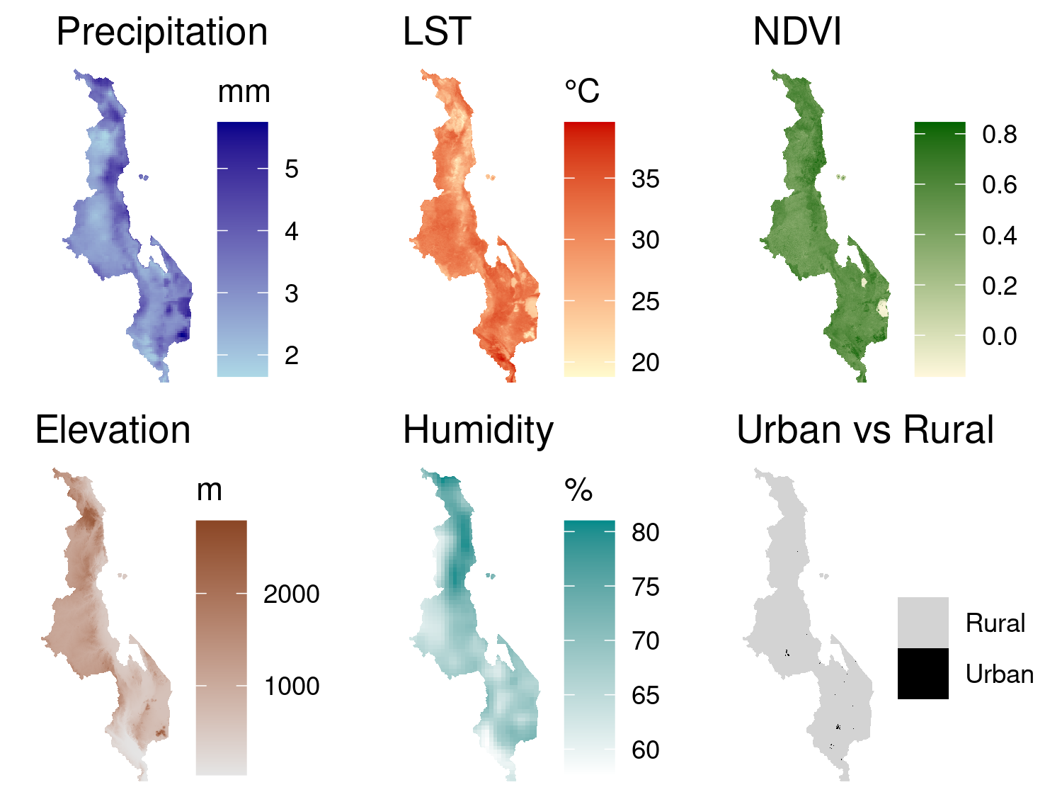
5.2.2 Exploratory analysis
To investigate how Plasmodium falciparum prevalence varies with environmental conditions, we begin by computing the empirical logit transformation of the observed prevalence at each survey location. Each covariate is then explored in relation to the empirical logit using scatterplots. For continuous covariates, we produce scatter plots with two fitted curves: a LOESS smoother shown in red, and a linear spline model with a single change point shown in blue. The LOESS curve serves as a flexible, nonparametric reference for assessing the general trend in the data. The spline model provides a simple parametric approximation to this trend, with the change point selected based on visual inspection of where the LOESS curve departs from linearity.
# 1. Prepare data
mlw_sf <- mlw_sf %>%
  mutate(
    elogit = log((positive + 0.5) / (examined - positive + 0.5)),
    `Precipitation` = precip,
    `Temperature (°C)` = lst_c,
    `NDVI` = ndvi,
    `Elevation (m)` = elev,
    `Humidity (%)` = humidity,
    `Urbanicity` = factor(built_up, levels = c(0, 1), labels = c("Rural", "Urban"))
  )

# 2. Drop geometry and reshape
plot_data_cont <- mlw_sf %>%
  select(elogit, `Precipitation`, `Temperature (°C)`, `NDVI`, `Elevation (m)`, `Humidity (%)`) %>%
  st_drop_geometry() %>%
  pivot_longer(cols = -elogit, names_to = "Covariate", values_to = "Value")

plot_data_cat <- mlw_sf %>%
  select(elogit, Urbanicity) %>%
  st_drop_geometry()

# 3. Define change points
knots <- c(
  "Precipitation" = Inf,
  "Temperature (°C)" = 33,
  "NDVI" = Inf,
  "Elevation (m)" = 400,
  "Humidity (%)" = 65
)

# 4. Create individual continuous plots
plots <- lapply(split(plot_data_cont, plot_data_cont$Covariate), function(df) {
  var <- unique(df$Covariate)
  knot <- knots[[var]]

  df <- df %>%
    mutate(
      linear_part = Value,
      spline_part = pmax(Value - knot, 0)
    )

  ggplot(df, aes(x = Value, y = elogit)) +
    geom_point(alpha = 0.5, size = 1) +
    geom_smooth(method = "loess", se = FALSE, color = "red", linewidth = 1) +
    geom_smooth(method = "lm",
                formula = y ~ x + pmax(x - knot, 0),
                se = FALSE, color = "blue", linewidth = 1) +
    labs(x = var, y = NULL) +
    theme_minimal()
})

# 5. Add Urbanicity boxplot
p_urban <- ggplot(plot_data_cat, aes(x = Urbanicity, y = elogit)) +
  geom_boxplot(outlier.size = 0.5) +
  labs(x = "Urbanicity", y = NULL) +
  theme_minimal()

# 6. Assemble 2 x 3 plot grid
final_plot <- (plots[[1]] | plots[[2]] | plots[[3]]) /
  (plots[[4]] | plots[[5]] | p_urban) +
  plot_annotation(title = "Empirical logit of prevalence vs environmental covariates")

final_plot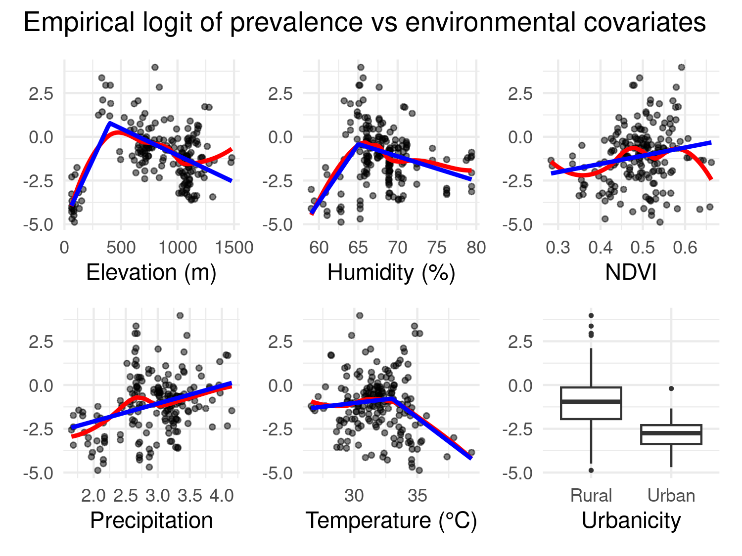
Figure 5.7 shows the results of this exploratory approach for the relationship between prevalence and covariates. For some variables, such as temperature, elevation, and humidity, there is a clear nonlinear association that is reasonably captured by a single change point. For others, including precipitation and NDVI, the relationship appears approximately linear, and for this reason no change point is used in the spline fit.
Urbanicity is treated separately as a binary covariate and visualized with a boxplot comparing the empirical logit of prevalence between rural and urban settings. The boxplot indicates that, as we expect, the level of prevalence in urban areas is considerable lower than in rural areas.
To assess the degree of correlation between covariates, we compute the pairwise Pearson correlation coefficients among the continuous environmental variables.
library(ggcorrplot)

# Select continuous covariates only
cont_vars <- mlw_sf %>%
  st_drop_geometry() %>%
  select(Precipitation = precip,
         Temperature = lst_c,
         NDVI = ndvi,
         Elevation = elev,
         Humidity = humidity)

# Compute correlation matrix
corr_mat <- cor(cont_vars, use = "complete.obs")

# Plot correlation matrix
ggcorrplot(corr_mat,
           method = "circle",
           type = "lower",
           lab = TRUE,
           lab_size = 3,
           colors = c("blue", "white", "red"),
           title = "Correlation between covariates",
           ggtheme = theme_minimal())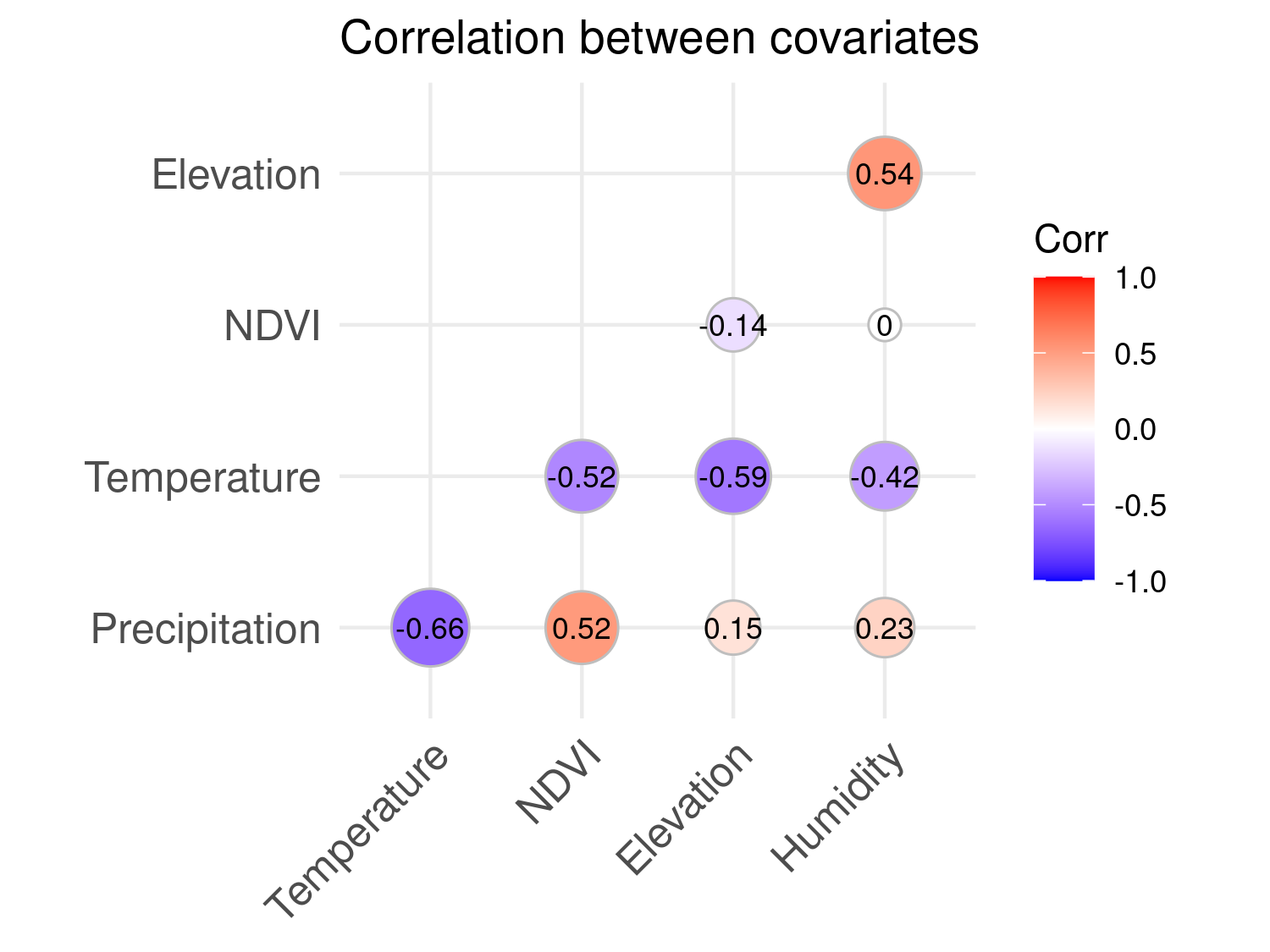
The correlations, shown in Figure Figure 5.8, are generally moderate in magnitude, ranging from –0.66 between temperature and precipitation to 0.54 between elevation and relative humidity. These values indicate that collinearity is not a major concern in our model development. Each covariate is likely to provide complementary information about malaria risk, and the absence of strong dependencies also supports the reliability of the scatterplots used to explore their individual relationships with prevalence.
We also perform a principal component analysis (PCA) on the standardized continuous environmental covariates to assess the potential for reducing dimensionality in our model. The code below shows the implementation of the PCA.
library(factoextra)

# Prepare only continuous covariates and standardize
pca_data <- mlw_sf %>%
  st_drop_geometry() %>%
  select(Precipitation = precip,
         Temperature = lst_c,
         NDVI = ndvi,
         Elevation = elev,
         Humidity = humidity) %>%
  scale()

# Perform PCA
pca_result <- prcomp(pca_data)

# Scree plot
fviz_eig(pca_result, addlabels = TRUE, barfill = "steelblue", barcolor = "grey30") +
  theme_minimal()
The scree plot in Figure Figure 5.9 shows the proportion of variance explained by each principal component. The first principal component (PC1) explains approximately 50% of the total variation, suggesting it captures a substantial environmental gradient across the study region. Although additional components may carry useful information, PC1 stands out as a potential candidate for use in model building as a composite environmental index and spatial predictor of malaria prevalence.
| Covariate | PC1 | PC2 |
|---|---|---|
| Precipitation | -0.480 | -0.339 |
| Temperature | 0.596 | 0.043 |
| NDVI | -0.338 | -0.605 |
| Elevation | -0.391 | 0.560 |
| Humidity | -0.385 | 0.451 |
Table Table 5.2 displays the loadings of the first two principal components. The sign and magnitude of each loading reflect how much each standardized covariate contributes to the corresponding component. PC1 shows strong positive loading for temperature and strong negative loadings for precipitation, humidity, and elevation. This suggests that PC1 represents a gradient from cool, humid, high-elevation areas with more rainfall to hotter, drier lowland regions. NDVI also contributes negatively, implying more vegetation cover in cooler, wetter zones. We can thus interpret PC1 as a general heat-aridity gradient, which well aligns with known ecological drivers of malaria risk.
# Create raster for PC1
r_stack_std <- scale(r_covs[[c("precip", "lst_c", "ndvi", "elev", "humidity")]])
pc1_weights <- c(-0.480, 0.596, -0.338, -0.391, -0.385)
pc1_rast <- sum(r_stack_std * pc1_weights)
names(pc1_rast) <- "PC1"

# Extract PC1 values
pc1_vals <- terra::extract(pc1_rast, vect(mlw_sf))
mlw_sf$PC1 <- pc1_vals[, 2]

# Convert raster to df for ggplot
pc1_df <- as.data.frame(pc1_rast, xy = TRUE, na.rm = TRUE)
names(pc1_df) <- c("x", "y", "PC1")

# --- Create PC1 map plot ---
p_map <- ggplot(pc1_df, aes(x = x, y = y, fill = PC1)) +
  geom_raster() +
  scale_fill_viridis_c(option = "C") +
  coord_equal() +
  theme_void() +
  ggtitle("PC1: Environmental Gradient")

# --- Create scatterplot with LOESS and spline ---
knot_pc1 <- 0.75
scatter_df <- mlw_sf %>%
  mutate(spline_part = pmax(PC1 - knot_pc1, 0))

p_scatter <- ggplot(scatter_df, aes(x = PC1, y = elogit)) +
  geom_point(alpha = 0.5, size = 1) +
  geom_smooth(method = "loess", se = FALSE, color = "red", linewidth = 1) +
  geom_smooth(method = "lm", formula = y ~ x + pmax(x - knot_pc1, 0),
              se = FALSE, color = "blue", linewidth = 1) +
  theme_minimal() +
  labs(x = "PC1", y = "Empirical logit") +
  ggtitle("Empirical logit vs PC1")

# --- Combine using patchwork ---
# Also add some margin space
p_map <- p_map + theme(plot.margin = margin(r = 20))
p_scatter <- p_scatter + theme(plot.margin = margin(l = 20))
p_map + p_scatter
Figure 5.10 displays the map of PC1 alongside its relationship with malaria prevalence. As done previously, to aid interpretation, we fit a LOESS curve (red) to visualise the general trend, and a linear spline (blue) with a change point at 0.75 to capture a simplified parametric relationship. The spline fit suggests a nonlinear association: malaria risk increases with PC1 up to around 0.75, after which it begins to decline. This pattern implies that malaria prevalence is highest in areas with intermediate PC1 values, i.e. environments that are neither too cold and wet nor too hot and arid. In other words, there appears to be an optimal range of environmental conditions, as summarised by PC1, that are most conducive to malaria transmission. Beyond this range, particularly in more heat-arid regions, the risk may decline due to ecological constraints on mosquito survival or parasite development.
In the next section, we compare two modelling approaches. The first model includes the original environmental covariates using the linear spline specifications identified during our exploratory analysis. The second model replaces these covariates with PC1 alone, treating it as a composite spatial predictor that summarises the dominant environmental gradient in the study area. In both models, we include urbanicity as a separate fixed effect. Urbanicity is excluded from the PCA because it is a binary variable and highly unbalanced, with most survey locations classified as rural. Modelling it separately ensures that its distinct contribution to malaria risk, more linked to infrastructure, housing conditions, and land use, is properly accounted for.
5.2.3 Model fitting and spatial prediction
In this section, we fit two geostatistical models to malaria prevalence data from Malawi, comparing the effects of using separate environmental covariates versus summarizing them into a principal component.
The first model (mod_all_cov) includes all environmental covariates as separate predictors. Namely these are precipitation \(d_{\text{prec}}(x)\), NDVI \(d_{\text{ndvi}}(x)\), temperature \(d_{\text{temp}}(x)\), elevation \(d_{\text{elev}}(x)\), humidity \(d_{\text{hum}}(x)\), and urbanicity \(d_{\text{urb}}(x)\). Following from the results of the exploratory analysis, nonlinear effects for temperature, elevation, and humidity are modeled using linear splines with thresholds at 33°C, 400 m, and 65%, respectively. The logit-linear model is:
\[ \begin{aligned} \log\left\{\frac{p(x)}{1 - p(x)}\right\} =\; & \beta_0 + \beta_1 d_{\text{prec}}(x) + \beta_2 d_{\text{ndvi}}(x) + \beta_3 d_{\text{temp}}(x) + \beta_4 \max\{d_{\text{temp}}(x) - 33,\; 0\} \\\\ & + \beta_5 d_{\text{elev}}(x) + \beta_6 \max\{d_{\text{elev}}(x) - 400,\; 0\} \\\\ & + \beta_7 d_{\text{hum}}(x) + \beta_8 \max\{d_{\text{hum}}(x) - 65,\; 0\} \\\\ & + \beta_9 d_{\text{urb}}(x) + S(x) \end{aligned} \].
The second model (mod_pca) replaces the continuous covariates with their first principal component \(\text{PC}_1(x)\), allowing for a spline above 0.75. The model becomes:
\[ \log\left\{\frac{p(x)}{1-p(x)}\right\} = \beta_0 + \beta_1 \text{PC}_1(x) + \beta_2 \max\{\text{PC}_1(x) - 0.75,0\} + \beta_3 d_{\text{urb}}(x) + S(x) \]
This formulation allows us to assess whether the dimensionality reduction via PCA retains the essential variation in environmental risk while simplifying the model structure.
# Model with all the covariates as separate predictors
mod_all_cov <-
glgpm(positive ~
    precip +
    ndvi +
    lst_c + pmax(lst_c - 33, 0) +
    elev + pmax(elev - 400, 0) +
    humidity + pmax(humidity - 65, 0) +
    built_up + gp(),
    den = examined,
    data = mlw_sf,
    family = "binomial")

# Model with all the covariates (except `built_up`)
# combined into PC1 which is then used as predictor
mod_pca <-
  glgpm(positive ~
          PC1 + pmax(PC1 - 0.75, 0) +
          built_up + gp(),
        den = examined,
        data = mlw_sf,
        family = "binomial")
After fitting the two models, when can then compare the summaries of the fits.
summary(mod_all_cov)Call:
glgpm(formula = positive ~ precip + ndvi + lst_c + pmax(lst_c -
33, 0) + elev + pmax(elev - 400, 0) + humidity + pmax(humidity -
65, 0) + built_up + gp(), data = mlw_sf, family = "binomial",
den = examined)
Binomial geostatistical linear model
Link: canonical (logit)
Inverse link function = 1 / (1 + exp(-x))
'Lower limit' and 'Upper limit' are the limits of the 95% confidence level intervals
Regression coefficients
Estimate Lower limit Upper limit StdErr z.value
(Intercept) -4.1484e+01 -5.4098e+01 -2.8871e+01 6.4356e+00 -6.4461
precip 3.6000e-01 2.0822e-01 5.1178e-01 7.7441e-02 4.6487
ndvi 5.1991e+00 4.3228e+00 6.0754e+00 4.4710e-01 11.6285
lst_c 9.9929e-02 6.9301e-02 1.3056e-01 1.5626e-02 6.3948
pmax(lst_c - 33, 0) 3.0237e-01 2.5342e-01 3.5132e-01 2.4973e-02 12.1076
elev 1.0984e-02 1.0581e-02 1.1386e-02 2.0527e-04 53.5074
pmax(elev - 400, 0) -1.1358e-02 -1.1732e-02 -1.0984e-02 1.9088e-04 -59.5030
humidity 4.7098e-01 4.4719e-01 4.9476e-01 1.2135e-02 38.8129
pmax(humidity - 65, 0) -6.8110e-01 -7.0309e-01 -6.5912e-01 1.1217e-02 -60.7232
built_up -6.8574e-01 -7.4216e-01 -6.2931e-01 2.8788e-02 -23.8200
p.value
(Intercept) 1.148e-10 ***
precip 3.340e-06 ***
ndvi < 2.2e-16 ***
lst_c 1.607e-10 ***
pmax(lst_c - 33, 0) < 2.2e-16 ***
elev < 2.2e-16 ***
pmax(elev - 400, 0) < 2.2e-16 ***
humidity < 2.2e-16 ***
pmax(humidity - 65, 0) < 2.2e-16 ***
built_up < 2.2e-16 ***
---
Signif. codes: 0 '***' 0.001 '**' 0.01 '*' 0.05 '.' 0.1 ' ' 1
Spatial Gaussian process
Matern covariance parameters (kappa=0.5)
Estimate Lower limit Upper limit
Spatial process var. 0.95284 0.91937 0.9875
Spatial corr. scale 15.60594 15.02071 16.2140
Variance of the nugget effect fixed at 0
Log-likelihood: 13.833summary(mod_pca)Call:
glgpm(formula = positive ~ PC1 + pmax(PC1 - 0.75, 0) + built_up +
gp(), data = mlw_sf, family = "binomial", den = examined)
Binomial geostatistical linear model
Link: canonical (logit)
Inverse link function = 1 / (1 + exp(-x))
'Lower limit' and 'Upper limit' are the limits of the 95% confidence level intervals
Regression coefficients
Estimate Lower limit Upper limit StdErr z.value
(Intercept) -0.496575 -0.595285 -0.397866 0.050363 -9.8600
PC1 0.258180 0.194448 0.321912 0.032517 7.9399
pmax(PC1 - 0.75, 0) -1.076688 -1.170656 -0.982719 0.047944 -22.4572
built_up -0.542019 -0.654257 -0.429781 0.057265 -9.4650
p.value
(Intercept) < 2.2e-16 ***
PC1 2.024e-15 ***
pmax(PC1 - 0.75, 0) < 2.2e-16 ***
built_up < 2.2e-16 ***
---
Signif. codes: 0 '***' 0.001 '**' 0.01 '*' 0.05 '.' 0.1 ' ' 1
Spatial Gaussian process
Matern covariance parameters (kappa=0.5)
Estimate Lower limit Upper limit
Spatial process var. 2.0008 1.7939 2.2316
Spatial corr. scale 30.6995 27.8239 33.8724
Variance of the nugget effect fixed at 0
Log-likelihood: 15.90143In the output above, we see that, compared to the model using all covariates as separate predictors, the model including only PC1 exhibits both a larger estimated spatial correlation scale and higher spatial variance. This indicates that replacing the original covariates with PC1 captures a smaller proportion of the spatial variation in prevalence, leaving the spatial Gaussian process to account for more of the structured residual variability.
We then compare the predicted prevalence from each model using a regular 5 by 5 km grid covering the whole of Malawi, and display the results in Figure 5.11. The maps show broadly similar spatial patterns, with both models identifying areas of high and low predicted prevalence in the southern region of the country. However, these visual comparisons do not allow us to determine which model performs better. We address this question in the next stage of the analysis by formally assessing the calibration and sharpness of the predictions generated by each model.
# Create a 5 by 5 regular grid
grid_mlw <- create_grid(mlw_admin0_sf, spat_res = 5)

# Extract the covariates over the grid
r_covs <- terra::project(r_covs, paste0("epsg:",mlw_crs))
pc1_rast <- terra::project(pc1_rast, paste0("epsg:",mlw_crs))

predictors <- cbind(terra::extract(r_covs,  st_coordinates(grid_mlw)),
                    terra::extract(pc1_rast,  st_coordinates(grid_mlw)))

# Prevalence prediction over the grid for the two fitted models
pred_all_cov <- pred_over_grid(mod_all_cov,
                               grid_pred = grid_mlw,
                               predictors = predictors)

pred_pca <- pred_over_grid(mod_pca,
                           grid_pred = grid_mlw,
                           predictors = predictors)

pred_all_cov_prev <- pred_target_grid(pred_all_cov,
                                      f_target = list(prev = function(x) exp(x)/(1+exp(x))))

pred_pca_prev <- pred_target_grid(pred_pca,
f_target = list(prev = function(x) exp(x)/(1+exp(x))))par(mfrow = c(1,2))
plot(pred_all_cov_prev, which_target = "prev", which_summary = "mean",
main = "Model: 'all_cov'", range = c(0,1))
plot(pred_pca_prev, which_target = "prev", which_summary = "mean",
main = "Model: 'pca'", range = c(0,1))
5.2.4 Comparison of the predictive performance between models
To evaluate predictive performance, we use three spatially distinct hold-out test sets corresponding to the Northern, Central, and Southern regions of Malawi, as illustrated in Figure 5.12. These were constructed using the assess_pp function with method = "cluster" and fold = 3, ensuring geographically stratified cross-validation.
The CRPS score shows that the model including all environmental covariates achieves better predictive accuracy across all test sets. Specifically, it yields a lower average CRPS. This improvement is consistent across the three hold-out data, with particularly notable gains in Test Set 1. Additionally, the non-randomized probability integral transform (AnPIT) plot, shown in Figure 5.13, demonstrates that the full covariate model is better calibrated: its cumulative distribution curves lie closer to the identity line, suggesting that the predicted probabilities align more closely with observed prevalence.
plot_AnPIT(assess_pred_mlw, mode = "all")

summary(assess_pred_mlw)
Summary of Cross-Validation Scores
----------------------------------
Model: all_cov
Test Set 1:
CRPS: 1.9452
Test Set 2:
CRPS: 2.1383
Test Set 3:
CRPS: 1.5148
Overall average across test sets:
CRPS: 1.9067
Model: pca
Test Set 1:
CRPS: 2.8064
Test Set 2:
CRPS: 2.5029
Test Set 3:
CRPS: 1.9321
Overall average across test sets:
CRPS: 2.6220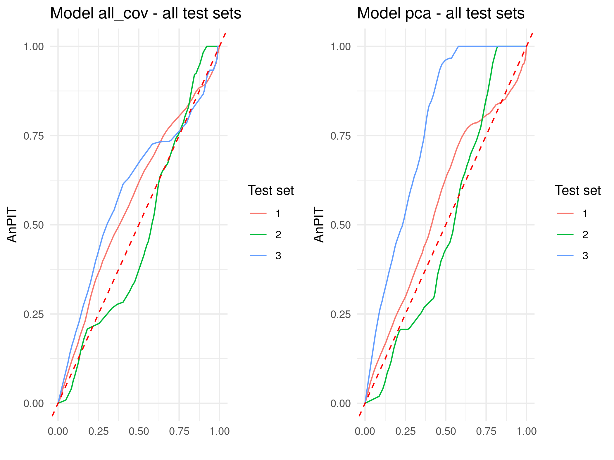
5.2.5 Summary and conclusions
In this case study, we have walked through the full pipeline of conducting a geostatistical analysis of malaria prevalence using Malaria Indicator Survey data from Malawi. We began by downloading geo-referenced survey data from the malariaAtlas R package and retrieving relevant environmental covariates from Google Earth Engine. These covariates, selected for their mechanistic relevance to malaria transmission, were processed, clipped to the national boundary, and extracted at survey locations to be used as predictors in subsequent modelling.
A critical step in the analysis involved the exploration of relationships between environmental conditions and malaria prevalence. Through scatterplots and spline fits, we identified key nonlinearities in variables such as temperature, elevation, and humidity, which informed the functional form of covariate effects in the regression model. This exploratory work is essential not only for model formulation but also for understanding the ecological underpinnings of disease risk.
To address potential collinearity and reduce the complexity of the model, we also illustrated the use of PCA as a method for dimensionality reduction. The first principal component (PC1) captured a dominant environmental gradient, summarizing variation across temperature, humidity, elevation, and vegetation, which was then used as a composite predictor in a reduced model. A simpler alternative is to let the data guide you through stepwise selection based on p-values—for example, adding or removing covariates until all retained terms meet a preset significance threshold. When the pool of candidate predictors is large relative to the sample size, however, stepwise methods can become unstable and over-fit; in such cases penalised approaches (e.g. ridge, lasso) or resampling-based strategies are usually preferred. A thorough discussion of these issues, with practical recommendations, is given in Section 4.7 of Harrell (2015).
We compared two geostatistical models: one using all environmental covariates as separate predictors (with spline terms for nonlinear effects), and another using PC1 as a summary predictor. Cross-validation based on geographically stratified folds revealed that the full model was better calibrated and achieved sharper predictions, as measured by lower CRPS and AnPIT curves closer to the identity line.
We encourage the reader to explore Exercise 2 at the end of this chapter, where you will investigate whether including a second principal component (PC2) alongside PC1 leads to improved predictive performance. This offers an opportunity to assess whether PCA-based dimensionality reduction can match or exceed the predictive accuracy of models that include all covariates, while potentially offering greater parsimony.
5.3 Mapping the vector index for West Nile Virus in the Sacramento Metropolitan Area, United States
In this section, we analyse entomological surveillance data on Culex pipiens in the Sacramento Metropolitan Area (SMA), California, from 2015 to 2021. Cx. pipiens is one of the primary vectors of West Nile virus (WNV) in North America (Petersen, Brault, and Nasci 2013; Kramer, Li, and Shi 2007). WNV is a mosquito borne flavivirus sustained in an enzootic cycle, that is, persistent circulation of the virus within non human animal populations, primarily birds, in a defined geographic area. Transmission is maintained between Culex mosquitoes and birds, while humans and other mammals are incidental dead end hosts that do not contribute to further transmission. Most human infections are asymptomatic, a minority present with febrile illness, and a small proportion develop neuroinvasive disease (Petersen, Brault, and Nasci 2013). Surveillance of both vector abundance and WNV infection prevalence is therefore important for anticipating human risk and guiding public health interventions.
In this analysis, we quantify local entomological risk using the vector index (VI), defined as \[ \text{VI} \;=\; \text{abundance} \times \text{infection prevalence}. \tag{5.3}\] Here, abundance is the mean number of female mosquitoes collected per trap night, and infection prevalence is the estimated proportion of mosquitoes infected with WNV in the vector population. In practice, prevalence is inferred from pooled PCR testing using maximum likelihood estimators for pooled samples (Centers for Disease Control and Prevention 2024). Many operational analyses also report the minimum infection rate and apply either the maximum likelihood estimate or the minimum infection rate when computing the vector index (e.g., Bolling et al. 2009; Jones et al. 2011). In this section, we extend these approaches using model-based geostatistics.
In what follows, we model abundance and infection prevalence for Cx. pipiens as two independent processes and combine the resulting estimates to obtain VI. We return to this assumption and other limitations of the analysis in Section 5.3.3.
5.3.1 Modelling the abundance of Culex pipiens
We begin by loading the necessary libraries and the data derived from the vectorsurvR package in R. The original datasets, sample_pools and sample_collections, contain mosquito surveillance data from California, including species identification, collection date, location, pathogen testing results, trap type, and trapping effort. For this case study, these have been processed to produce abund_sma in the RiskMap package, which summarises the abundance of female Culex pipiens within the Sacramento Metropolitan Area (SMA).
rm(list = ls())

library(ggplot2)
library(patchwork)

data(abund_sma)
str(abund_sma)
## 'data.frame':    1551 obs. of  6 variables:
##  $ lon          : num  -121 -121 -121 -121 -121 ...
##  $ lat          : num  38.9 38.8 38.9 38.8 38.9 ...
##  $ total_females: int  1 36 6 31 1 1 1 1 1 4 ...
##  $ date         : Date, format: "2015-01-02" "2015-01-02" ...
##  $ trap_nights  : int  15 15 15 8 8 8 8 6 6 6 ...
##  $ trap_type    : chr  "NJLT" "NJLT" "NJLT" "GRVD" ...
The outcome variable for this analysis is total_females, which records the total number of Cx. pipiens captured in a single trap. The variable trap_nights indicates the number of nights the trap was deployed and is used to account for variation in sampling effort across traps. The dataset also records the type of trap used (trap_type), which can influence capture rates. Trap types include New Jersey Light Traps (NJLT), Gravid Traps (GRVD), Mosquito Magnet Traps (MMT), BG-Sentinel Traps (BGSENT), \(\text{CO}_2\)-baited traps (CO2), Backpack aspirators (BACKPACK), Lockyer traps (LCKR), and Ovitraps (OVI). These traps differ in their mode of attraction: for example, light traps attract host-seeking females using light, gravid traps target egg-laying females with an infusion lure, \(\text{CO}_2\)-baited and BG-Sentinel traps mimic host cues through carbon dioxide and human scent, and backpack or hand-collection methods are opportunistic. Based on average catch per trap-night, we group these into low-yield traps (Backpack, Lockyer, New Jersey Light Trap, Ovitrap), moderate-yield traps (Gravid Trap, Mosquito Magnet), and high-yield traps (\(\text{CO}_2\)-baited and BG-Sentinel), providing a more interpretable classification for analysing trap efficiency in subsequent modelling. We thus create the variable trap_group for later use in the model fitting as follows.
To provide spatial context, we use the rgeoboundaries package to download second-level administrative boundaries (ADM2) for the United States. We extract the boundaries for Placer, El Dorado and Sacrament counties which make up the SMA.
library(rgeoboundaries)

# Get California ADM2 units and filter to relevant counties
ca_counties <- geoboundaries("United States of America", adm_lvl = "ADM2")
sma_names <- c("Sacramento", "Placer", "El Dorado")
sma_boundaries <- ca_counties[ca_counties$shapeName %in% sma_names, ]
Given the time span of the data, it is important to consider the potential for temporal variation in mosquito abundance and infection prevalence. Changes in environmental conditions, climate, or vector control efforts may lead to substantial year-to-year fluctuations in mosquito populations. Additionally, if different geographic areas were sampled in different years, this could introduce spatial confounding, making it difficult to disentangle spatial from temporal effects.
The top panel of Figure 5.14 reveals that while some spatial variation in sampling locations is present across years, there remains sufficient geographic overlap to enable estimation of temporal trends in mosquito counts. Overall, Cx. pipiens abundance declines over time, although the trend is more pronounced in high-yield traps, while moderate- and low-yield traps exhibit a more variable pattern. The decline in Cx. pipiens likely reflects two key drivers: reduced availability of aquatic breeding sites due to drought, and intensified vector control efforts. Bhattachan et al. (2023) reported that Cx. pipiens populations in southern California dropped by about \(40%\) during the 2012–2016 drought, linked to water-use restrictions that limited larval habitat in storm drains and catch basins. At the same time, vector control districts expanded targeted interventions. For example, the Sacramento–Yolo district treated over 160,000 drains in 2018 alone (Sacramento-Yolo Mosquito and Vector Control District 2018), and the statewide response plan formalised such practices as part of integrated mosquito management (California Department of Public Health 2025). For these reasons, our model shall include a covariate for year, with a log-linear effect on the mean number of Cx. pipiens, under the expectation that abundance will show a decreasing trend over time.
# Creation of the variable year
abund_sma$year <- as.numeric(substr(abund_sma$date, 1, 4))

# bbox for coord_sf limits
bb <- st_bbox(sma_boundaries)
abund_sma <- st_as_sf(abund_sma, coords = c("lon","lat"), crs = 4326, remove = FALSE)


# Panel 1: faceted map, colored by trap_group (scales fixed!)
p_locs <- ggplot() +
  geom_sf(data = sma_boundaries, fill = NA, color = "black", linewidth = 0.3) +
  geom_sf(data = abund_sma, color = "black", alpha = 0.85, size = 0.9) +
  coord_sf(xlim = c(bb["xmin"], bb["xmax"]), ylim = c(bb["ymin"], bb["ymax"])) +
  facet_wrap(~ year, ncol = 4) +
  theme_minimal() +
  labs(title = "Trap locations by year") +
  theme(
    strip.text = element_text(size = 13, face = "bold"),
    plot.title = element_text(size = 16, face = "bold", hjust = 0.5),
    axis.text = element_blank(),
    axis.ticks = element_blank()
  )

# Panel 2: average mosquitoes per trap by year & trap_group
annual_summary <- abund_sma %>%
  group_by(year, trap_group) %>%
  summarise(
    total_mosquitoes = sum(total_females, na.rm = TRUE),
    total_traps = n(),
    mosq_per_trap = ifelse(total_traps > 0, total_mosquitoes / total_traps, NA_real_),
    .groups = "drop"
  )

p_pertrap <- ggplot(annual_summary,
                    aes(x = factor(year), y = mosq_per_trap, fill = trap_group)) +
  geom_col(position = position_dodge(width = 0.7), width = 0.7) +
  theme_minimal() +
  labs(title = "Average mosquitoes per trap by year and trap group",
       x = "Year", y = "Mosquitoes per trap", fill = "Trap group") +
  theme(
    plot.title = element_text(size = 14, face = "bold", hjust = 0.5),
    axis.title = element_text(size = 12),
    axis.text = element_text(size = 11)
  )

# Combine
(p_locs / p_pertrap) +
  plot_layout(heights = c(3, 1))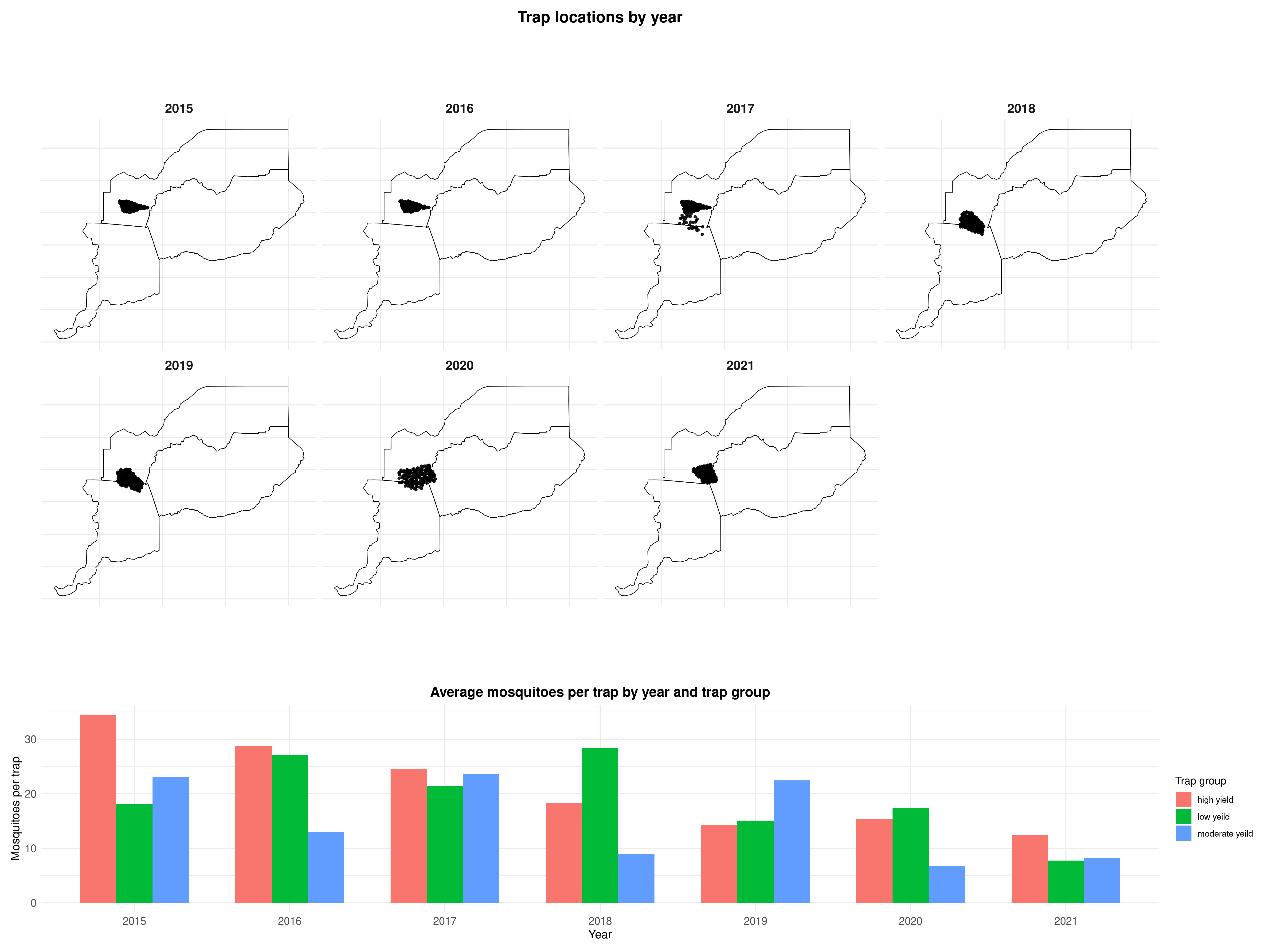
In our analysis, we first assess whether there is residual spatial correlation in mosquito counts by fitting the following Poisson mixed-effects model. Let \(Y_i\) denote the number of trapped female Cx. pipiens at location \(x_i\) and year \(t_i\). Conditionally on independent and identically distributed zero-mean Gaussian random effects \(Z_i \sim \mathcal{N}(0, \sigma^2)\), we assume: \[
Y_i \mid Z_i \sim \text{Poisson}(m_i\lambda_i),
\] where \(m_i\) is the number of nights during which the trap has been deployed, and \(\lambda_i\) is the average number of \(Cx. pipiens\) per trap-night, which we model as: \[
\begin{aligned}
\log\{\lambda_i\} = &
\sum_{j=1}^3 d_{j}(x_i, t_i) \beta_j + \beta_4 t_i +
Z_i \\\\
=& \: \mu_i + Z_i,
\end{aligned}
\tag{5.4}\] where the \(d_{j}(x_i, t_i)\) are binary indicators for the type of trap (\(j=1\) corresponding to “high-yield”, \(j=2\) to “moderate-yield” and \(j=3\) to “low-yield”) and \(\mu_i = \sum_{j=1}^3 d_{j}(x_i, t_i) \beta_j + \beta_4 t_i\). We then fit this model using the glmer function from the lme4 package as follows.
abund_sma$loc <- 1:nrow(abund_sma)

# In the fit, we scale the variable year to help convergence
glmer_wvn <- glmer(total_females ~ -1 + trap_group + scale(year) + offset(log(trap_nights)) + (1 | loc),
                   data = abund_sma, family = poisson,
                   nAGQ = 100)
summary(glmer_wvn)
Generalized linear mixed model fit by maximum likelihood (Adaptive
Gauss-Hermite Quadrature, nAGQ = 100) [glmerMod]
Family: poisson ( log )
Formula:
total_females ~ -1 + trap_group + scale(year) + offset(log(trap_nights)) +
(1 | loc)
Data: abund_sma
AIC BIC logLik -2*log(L) df.resid
5715.5 5742.2 -2852.7 5705.5 1546
Scaled residuals:
Min 1Q Median 3Q Max
-0.81365 -0.27049 -0.02063 0.10058 0.40034
Random effects:
Groups Name Variance Std.Dev.
loc (Intercept) 2.356 1.535
Number of obs: 1551, groups: loc, 1551
Fixed effects:
Estimate Std. Error z value Pr(>|z|)
trap_grouphigh yield 1.68272 0.06643 25.331 < 2e-16 ***
trap_grouplow yeild -0.41146 0.08736 -4.710 2.48e-06 ***
trap_groupmoderate yeild 0.29882 0.06762 4.419 9.92e-06 ***
scale(year) -0.20370 0.04206 -4.843 1.28e-06 ***
---
Signif. codes: 0 '***' 0.001 '**' 0.01 '*' 0.05 '.' 0.1 ' ' 1
Correlation of Fixed Effects:
trp_grphy trp_grply trp_grpmy
trp_grplwyl 0.006
trp_grpmdry -0.013 0.002
scale(year) -0.119 -0.014 0.150 The model summary indicates that, as expected, average mosquito counts decline over time. The effects associated with the different levels of trap_group also follow expectations, with high-yield traps having the highest average counts, followed by moderate- and low-yield traps. The relatively large estimate of the variance \(\sigma^2\) of the random effect \(Z_i\) suggests substantial extra-Poisson variation between traps that is not explained by the yearly decline and the type of trap.
We then use the empirical variogram computed on the estimated \(Z_i\) to assess the presence of residual spatial correlation.
# Extracting the estimates of the random effects
wnv_summary$Z_hat <- ranef(glmer_wvn)$loc[,1]

# Computing the empirical variogram
variogram_wnv <-
s_variogram(data = wnv_summary,
            variable = "Z_hat",
            n_permutation = 1000,
            scale_to_km = TRUE,
            bins = seq(0,10, length = 15))
We plot the empirical variogram and add the envelope generated under the assumption of absence of spatial correlation.
plot_s_variogram(variogram_wnv, plot_envelope = TRUE)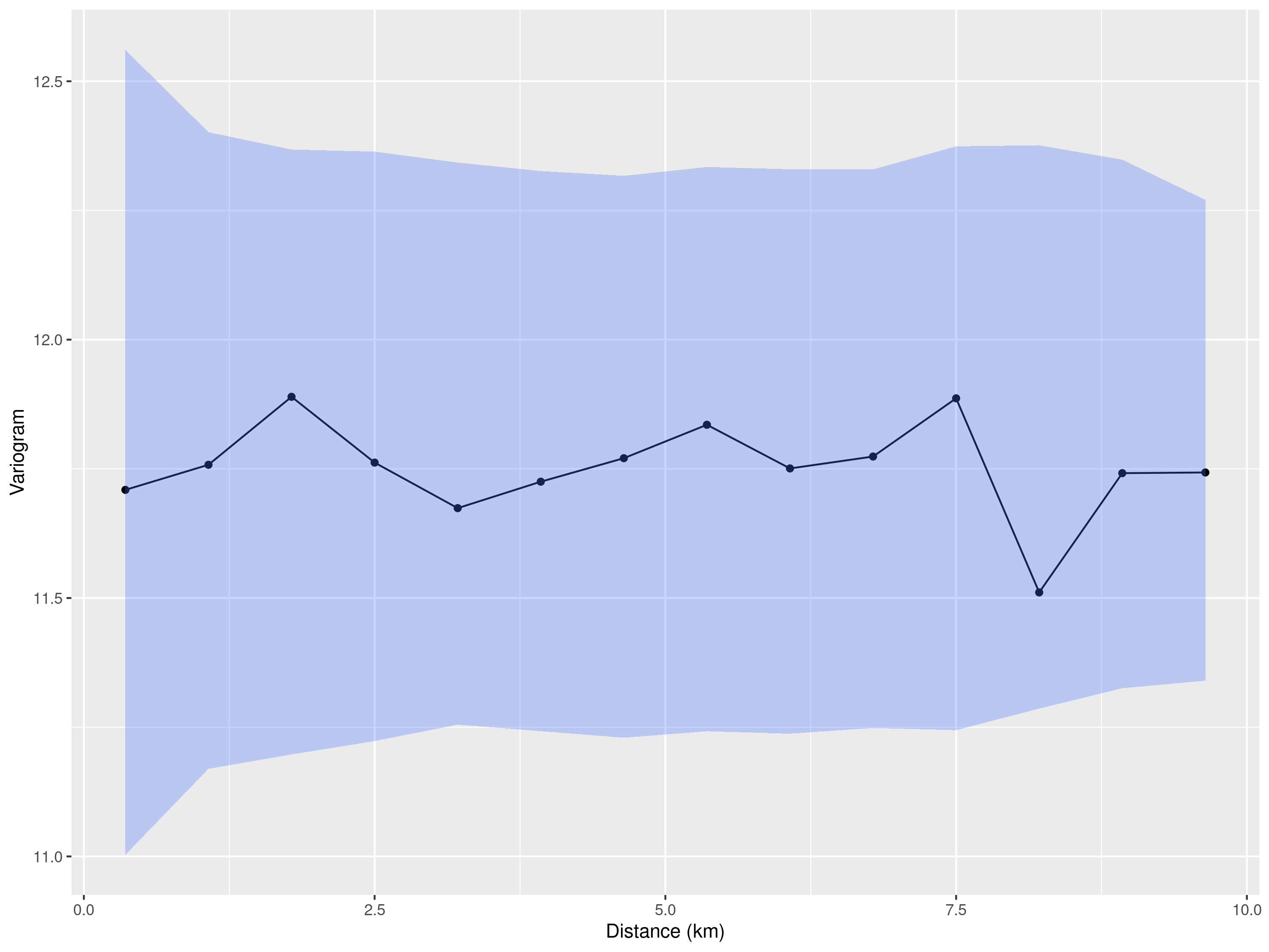
The empirical variogram shown in Figure 5.15 lies entirely within the simulation envelope, indicating no detectable spatial correlation in the residuals. This lack of evidence may be due to the fact that mosquito abundance is influenced by very local environmental conditions such as vegetation, drainage, or breeding site availability, which vary at spatial scales smaller than 1 km. Since only a few trap locations in the dataset are spaced closely enough to capture such fine-scale variation, the analysis may lack the resolution needed to detect spatial dependence. Therefore, although a geostatistical model is not justified in this case, we can still pursue our objective of estimating the average number of mosquitoes at the sampled locations using the model in Equation 5.4.
The principles used in this case to derive the predictive distribution of \(\lambda(x_i)\), the expected number of mosquitoes at a sampled location \(x_i\), are similar to those applied in geostatistical models. However, they take a simplified form here because we do not need to account for spatial correlation. The predictive distribution is given by: \[ \left[\lambda(x_i) \:\middle | \: Y_i = y_i \right] = \int [Z_i] \, [Y_i \mid Z_i] \, dZ_i \tag{5.5}\] In this expression, \([Z_i]\) denotes the density of a Gaussian distribution with mean zero and variance \(\sigma^2\), and \([Y_i \mid Z_i]\) is the likelihood from a Poisson model with mean \(\lambda(x_i)\). The integral in Equation 5.5 can be computed numerically in R with relative efficiency. This approach also allows for direct simulation from the predictive distribution, enabling us to compute any desired summary statistics.
For this analysis, we use a custom function called simulate_random_effects, which can be copied from Section 5.4.1 and pasted into an R script, as it is not included in the RiskMap package. Further details of its implementation are provided in Section 5.4.1; here, we focus solely on the analysis.
Hence, we first simulate 1000 samples from the predictive distribution of \(Z_i\) and denote those by \(Z_i^{(j)}\), for \(i=1,\ldots,598\), and \(j=1\ldots,1000\).
n_samples <- 1000
samples_z <- simulate_random_effects(glmer_wvn, n_sim = n_samples)
We then obtain predictive samples for \(\lambda(x_i)\) by applying the exponential transformation to the linear predictor \(\hat{\mu}_i + Z_{i}^{(j)}\), where in \(\hat{\mu}_i\) we have plugged in the maximum likelihood estimates of the regression coefficients.
The predictions shown in Figure 5.16 indicate that the pattern of the mean number of mosquitoes across sampled locations is broadly comparable across time.
# Create dataframe
mosq_df <- data.frame(
  id = 1:nrow(abund_sma),
  mean = mosq_mean,
  lower = mosq_lower,
  upper = mosq_upper
)

# Adding trap_group and year
mosq_df$trap_group <- abund_sma$trap_group[match(mosq_df$id, abund_sma$loc)]
mosq_df$year <- abund_sma$year[match(mosq_df$id, abund_sma$loc)]

# Rearranging the data-frame in increasing order based
# on the mean number of mosquitoes
# by year and trap group

mosq_df <- mosq_df %>%
  group_by(year, trap_group) %>%
  arrange(mean, .by_group = TRUE) %>%
  mutate(x_order = row_number()) %>%
  ungroup()

library(scales)  # Used for reporting the y-axis on the log-scale

ggplot(mosq_df, aes(x = x_order, y = mean,
                    color = trap_group, fill = trap_group, group = trap_group)) +
  geom_ribbon(aes(ymin = lower, ymax = upper), alpha = 0.20, linewidth = 0) +
  geom_line(linewidth = 0.9) +
  scale_y_log10(
    breaks = c(1, 10, 100, 1000),
    labels = label_number()
  ) +
  facet_wrap(~year, scales = "free_x") +
  labs(x = "Locations (ordered within trap group)",
       y = "Predicted no. mosquitoes (per trap-night)",
       color = "Trap group", fill = "Trap group") +
  theme_minimal()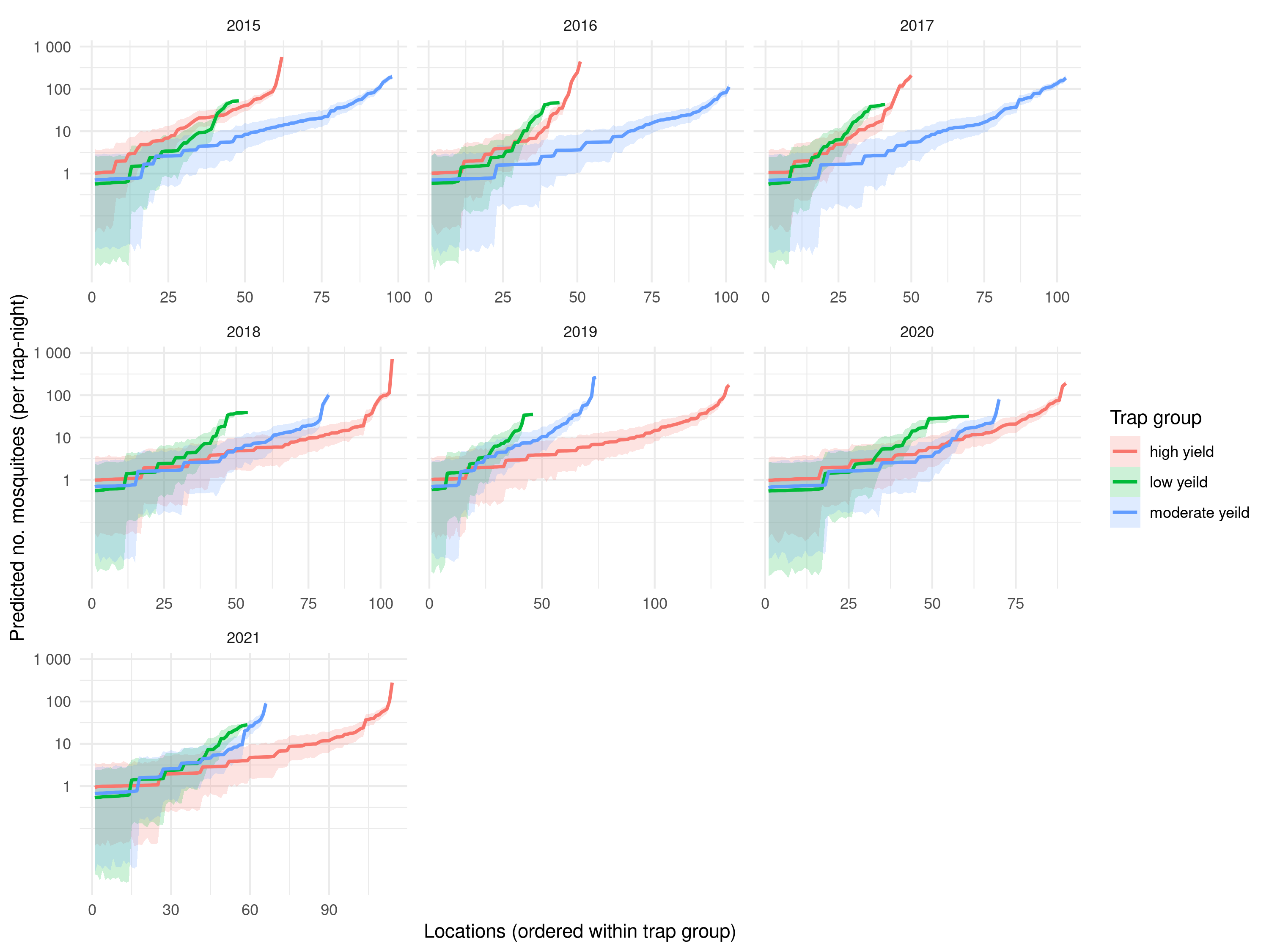
To understand whether we can trust the inferences shown in Figure 5.16, we use the AnPIT graphical check as used in the previous case studies. Since we are not using a geostatistical model in this case, we will use a simplified implementation of the AnPIT for the Poisson mixed model fitted in this section. The function that we use to compute the AnPIT is called anpit_wnv and has been implemented specifically for this case study. For more details on its implementation, read Section 5.4.2.
wnv_anpit_res <- anpit_wnv(glmer_wvn, test_prop = 0.30, nsim = 10000)In the code above the AnPIT is computed using a test-set corresponding to \(30\%\) of the original data-set. The number of simulation used to approximate the AnPIT is set to 1000. Finally, we plot the results.
plot_anpit(wnv_anpit_res)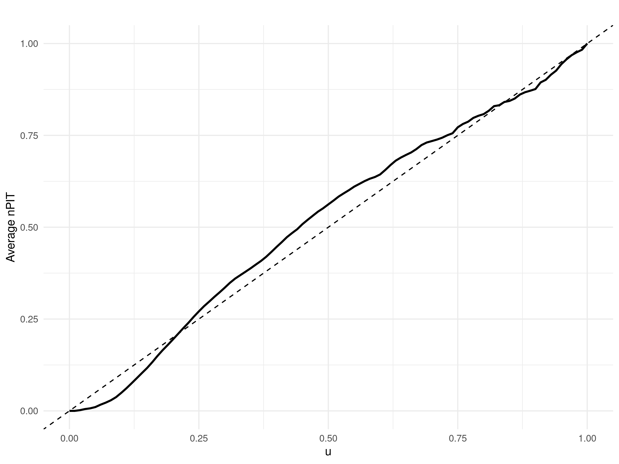
The results shown in Figure 5.17 an AnPIT curve from the fitted Poisson mixed model in Figure 5.17 that closely follows the identity line. Hence, we can conclude that we find no evidence against the compatibility of the model in Figure 5.17 with the data.
5.3.2 Modelling West Nile virus infection with pooled mosquito testing
Pooled testing is widely used in mosquito surveillance. Rather than testing each mosquito individually for a pathogen, multiple mosquitoes collected from the same location and week are combined into a single pool and assayed by PCR. The test returns positive if at least one mosquito in the pool is infected and negative otherwise. This approach greatly reduces laboratory time and costs, but statistical analysis must account for variation in pool size, as larger pools have a higher probability of testing positive even if the underlying infection risk per mosquito is low.
We illustrate this using West Nile virus (WNV) PCR results from pools of female Culex pipiens collected in the Sacramento Metropolitan Area, available in the infect_sma data set of the RiskMap package.
Let \(k_i\) be the number of mosquitoes in pool \(i\). Define the binary outcome \(Y_i=1\) if the PCR test for pool \(i\) is positive and \(Y_i=0\) otherwise. Conditional on a stationary and isotropic spatial Gaussian process \(S(x_i)\), the probability that pool \(i\) is positive is
\[
P(Y_i=1\mid S(x_i))=1-\left[1-p(x_i)\right]^{k_i},
\tag{5.6}\] where \(p(x_i)\) is the probability that an individual mosquito at location \(x_i\) is infected with WNV. We model \(p(x_i)\) using a logit-linear form
\[
\log\left\{\frac{p(x_i)}{1-p(x_i)}\right\}=\beta+S(x_i),
\tag{5.7}\] which explicitly incorporates the dependence of the pool positivity probability on pool size \(k_i\).
We must emphasize that in the infect_sma data set the pool sizes \(k_i\) are not taken directly from laboratory records but are estimated. For each pool, mosquito collections from nearby locations in the same epidemiological week and within a given spatial radius, for example 2 km, are identified. The total number of female mosquitoes from these nearby collections, denoted \(T_{\text{near}}\), is divided by the number of pools formed from the same nearby collections in that week, denoted \(m_{\text{near}}\), to obtain an estimate of pool size. The estimated pool size is therefore
\[
\widehat{k}_i=\text{round}\left(\max\{1,T_{\text{near}}/m_{\text{near}}\}\right),
\] and a default conservative value, such as 25, is used if no nearby collections are available.
The data comprise 596 responses, of which only 18 pools test positive. This very low prevalence constrains our modelling choices, for example by limiting the feasibility of incorporating temporal dynamics. As a result, the model in Equation 5.6 represents the simplest specification that can still capture spatial correlation, under the simplifying assumption that WNV risk remains relatively stable over the study period. Furthermore, because there is only a single binary outcome per location, overdispersion cannot occur (see box “Why Bernoulli extra‐variation does not exist” in Section 5.1.1 of P. J. Diggle and Giorgi (2019)), and the empirical variogram provides limited value for assessing spatial correlation due to its high uncertainty in this context. We therefore proceed directly to fitting a geostatistical model and assess the estimate of the spatial correlation parameter, which quantifies the strength and range of spatial dependence in the data.
We then proceed in R as follows. We first load the data and convert them into an sf object with the appropriate UTM projection.
data(infect_sma)

infect_sma <- st_as_sf(infect_sma, coords = c("lon", "lat"), crs = 4326)
wnv_crs <- propose_utm(infect_sma)
infect_sma <- st_transform(infect_sma, wnv_crs)
We define the inverse link function based on Equation 5.6 and Equation 5.7.
We then fit the model by passing the inverse link function to the argument invlink within the glgpm function.
Finally, we examine the the summary of the fitted model.
summary(inf_fit)Call:
glgpm(formula = wnv_pos ~ gp(lon, lat), data = infect_sma, family = "binomial",
invlink = invlink_wnv, crs = wnv_crs, par0 = coef(inf_fit),
start_pars = coef(inf_fit))
Binomial geostatistical linear model
Link: custom
Inverse link function = 1 - (1 - exp(x)/(1 + exp(x)))^infect_sma$est_pool_n
'Lower limit' and 'Upper limit' are the limits of the 95% confidence level intervals
Regression coefficients
Estimate Lower limit Upper limit StdErr z.value p.value
(Intercept) -4.9648 -7.0190 -2.9105 1.0481 -4.7369 2.17e-06 ***
---
Signif. codes: 0 '***' 0.001 '**' 0.01 '*' 0.05 '.' 0.1 ' ' 1
Spatial Gaussian process
Matern covariance parameters (kappa=0.5)
Estimate Lower limit Upper limit
Spatial process var. 5.9851 1.5402 23.259
Spatial corr. scale 24.5370 9.1354 65.905
Variance of the nugget effect fixed at 0
Log-likelihood: 0.4061681The fitted model indicates a substantial spatial residual component, with the estimated scale parameter corresponding to a practical range of approximately 70 km. This represents a long‐range correlation relative to the spatial extent of the study area.
We first carry out predictions over a regular grid covering the area of the data collection efforts from 2015 to 2021. To achieve this, we create a regular grid 250 meters within the convex hull boundaries obtained by the full set of locations sampled from 2015 to 2021 (see Figure 5.18).
# Compute convex hull
geom_union <- st_union(inf_fit$data_sf)
chull_sf <- st_convex_hull(geom_union)
chull_sf <- st_as_sf(data.frame(geometry = st_sfc(chull_sf)),
                     crs = st_crs(inf_fit$data_sf))

# Plot points and convex hull
ggplot() +
  geom_sf(data = inf_fit$data_sf, color = "blue", size = 1) +
  geom_sf(data = chull_sf, fill = NA, color = "red", linewidth = 1) +
  theme_minimal()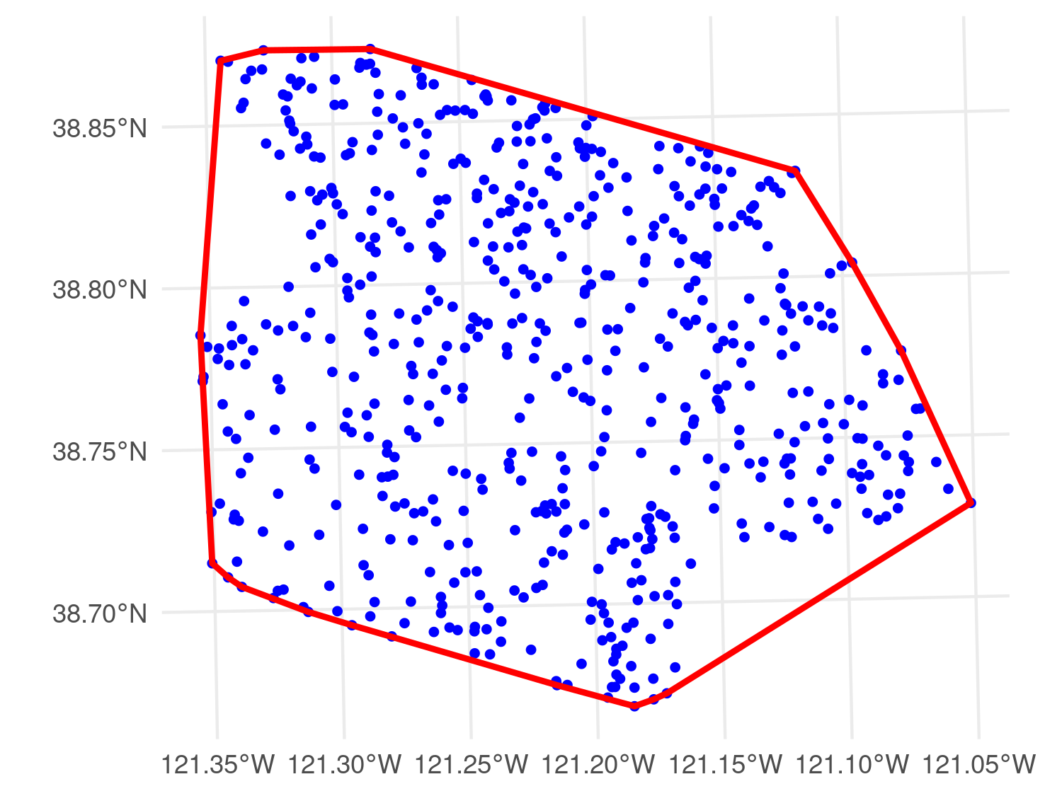
grid_pred_sac <- create_grid(chull_sf, spat_res = 0.25)

pred_S_inf <- pred_over_grid(inf_fit,
                             grid_pred = grid_pred_sac)

pred_inf_grid <- pred_target_grid(pred_S_inf,
                                  f_target = list(prev = function(x) exp(x)/(1+exp(x))))
Figure 5.19 displays the predictive mean of \(p(x)\) over the regular grid. Overall, the predicted prevalence of WNV is very low across the study area, with a small zone in the south‐west showing a relatively higher value of approximately \(0.40\%\).
plot(pred_inf_grid,"prev")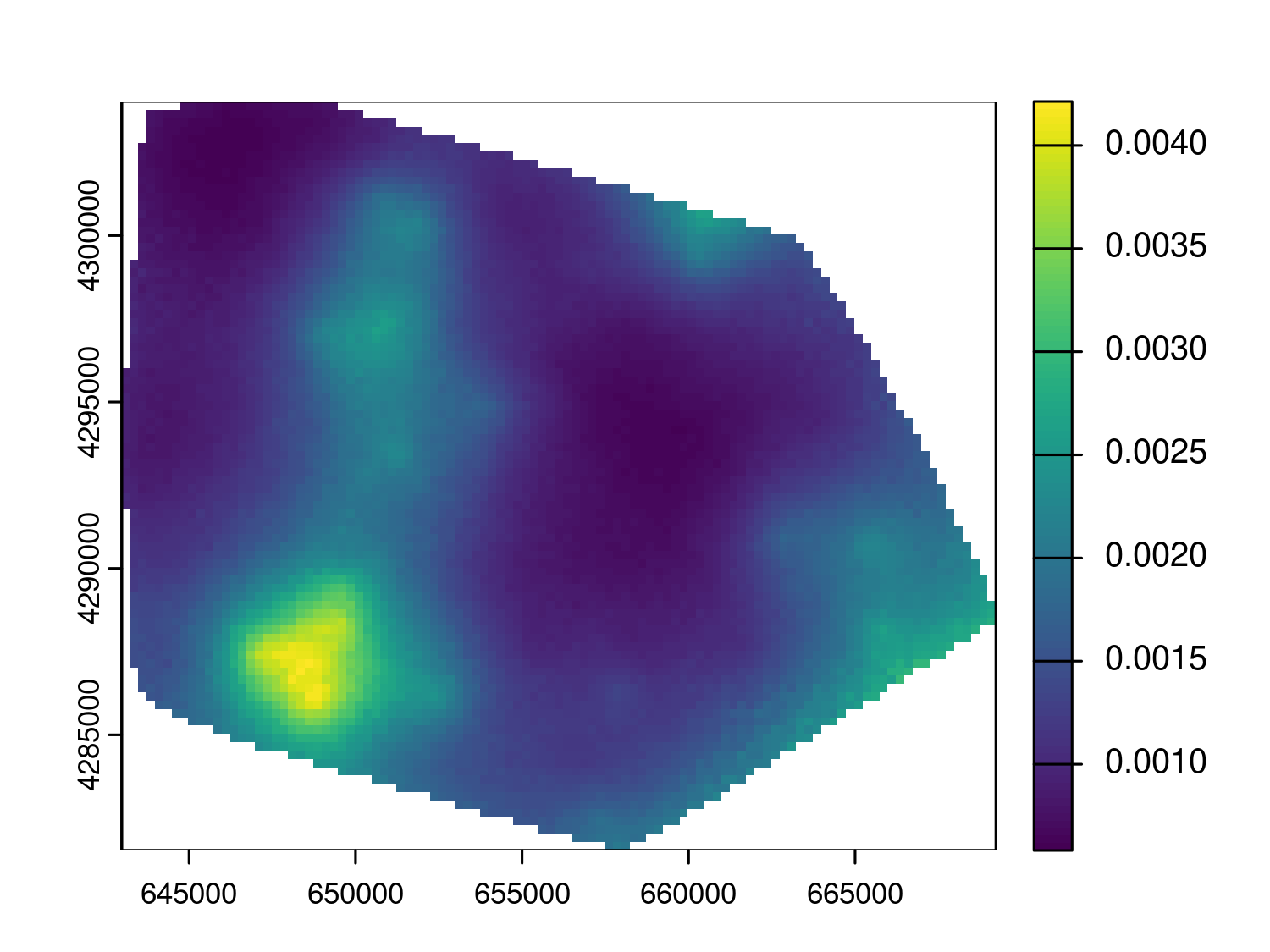
Finally, we predict the vector index as defined in Equation 5.3. Because Cx. pipiens abundance and WNV infection prevalence have been modelled as independent processes, the predictions from the two models can be combined directly. Specifically, for each location in the abund_sma data set, we take predictive samples of WNV prevalence and multiply them by the corresponding predictive samples of the mean number of female Cx. pipiens per trap‐night. This yields predictive samples of the vector index, which can then be summarised or mapped as required. In R, this is implemented as follows.
# Converting the abund_sma into an sf object
loc_pred <- st_as_sfc(st_transform(st_as_sf(abund_sma, coords = c("lon","lat"), crs = 4326), crs = wnv_crs))

# Prediction of the sptial process S(x) over the locations of the
# abund_sma data-set
pred_S_loc <- pred_over_grid(inf_fit, grid_pred = loc_pred)

# Computation of the samples for West Nile Virus prevalence
beta_hat <- coef(inf_fit)$beta
prev_inf_samples <- 1/(1+exp(-(beta_hat +
                                 pred_S_loc$S_samples)))

# Predictive samples for the vector index (VI)
vi_samples <- mean_nmosq * prev_inf_samples

# Calculate predictive summaries for VI
vi_mean  <- apply(vi_samples, 1, mean, na.rm = TRUE)
vi_lower <- apply(vi_samples, 1, quantile, probs = 0.025, na.rm = TRUE)
vi_upper <- apply(vi_samples, 1, quantile, probs = 0.975, na.rm = TRUE)

# Build dataframe directly from original abund_sma order
vi_df <- data.frame(
  id    = 1:nrow(abund_sma),
  mean  = vi_mean,
  lower = vi_lower,
  upper = vi_upper,
  trap_group = abund_sma$trap_group,
  year       = abund_sma$year
)

# Order within (year, trap_group) by increasing mean
vi_df <- vi_df %>%
  group_by(year, trap_group) %>%
  arrange(mean, .by_group = TRUE) %>%
  mutate(x_order = dplyr::row_number()) %>%
  ungroup()
Several U.S. programs consider a vector index (VI) of 0.75 or higher as indicative of likely human transmission and use this threshold to trigger intensified control measures (City of Boulder 2025; City of Fort Collins 2025, 2014). In Figure 5.20, the dashed red line marks this operational threshold for elevated WNV risk. We observe that only in few instances before the year 2020 the predicted VI exceeded this threshold. We thus conclude that between 2015 and 2021 the risk for WNV based as measured by the VI was relatively low in the SMA.
ggplot(vi_df,
       aes(x = x_order, y = mean,
           color = trap_group, fill = trap_group, group = trap_group)) +
  geom_hline(yintercept = 0.75, linetype = "dashed", color = "red", linewidth = 0.8) +
  geom_ribbon(aes(ymin = lower, ymax = upper), alpha = 0.20, linewidth = 0) +
  geom_line(linewidth = 0.9) +
  scale_y_log10(
    breaks = c(0.01, 0.1, 1),
    labels = scales::label_number()
  ) +
  facet_wrap(~ year, scales = "free_x") +
  labs(
    x = "Locations (ordered within trap group)",
    y = "Vector index (infected mosquitoes per trap night)",
    title = "West Nile Virus",
    color = "Trap group", fill = "Trap group"
  ) +
  theme_minimal()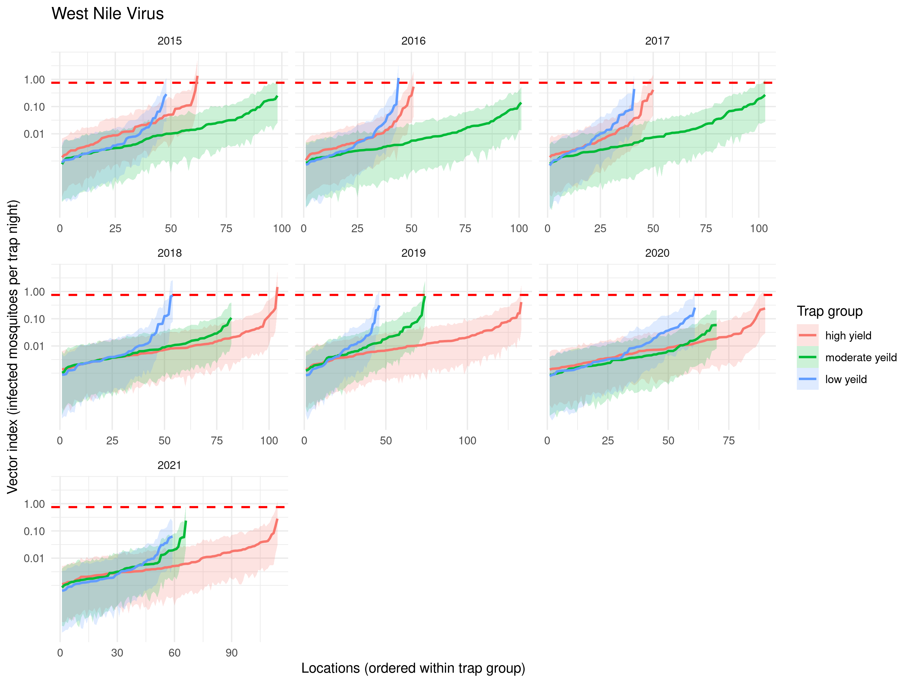
5.3.3 Summary and conclusions
In this analysis, our predictive target was the vector index (VI) in Equation 5.3. Our proposed modelling approach was based on the assumption that abundance and infection prevalence are two independent processes. Treating prevalence as independent of vector density is a practical simplification. It can be reasonable when the fraction of infected mosquitoes at a place and time is driven mainly by host infection dynamics, temperature dependent incubation, and mosquito age structure, whereas trap counts reflect local production, as well as catchability. An interesting result of our analysis is that abundance showed no detectable residual spatial correlation, while infection prevalence did. The empirical variogram of random effects from the abundance model lay within the envelope in Figure 5.15, suggesting that remaining variation after accounting for year and trap group is dominated by micro scale heterogeneity and trap specific noise at distances smaller than those represented by the sampling design. In contrast, the infection model estimated a spatial scale of correlation that is large relative to the study area, and may be explained in terms of processes that operate over broader extents, such as movement and aggregation of avian reservoir hosts, shared urban landscape features, and temperature fields. However, as a result of the disparity in the scales of spatial dependence for the two processes and the inability of the model for abundance to interpolate at unobserved locations, we could only predict the VI at the observed locations of the abundance data.
All West Nile virus data analysed in this section originate from the vectorsurvR workflow and are simulated rather than observed in the field. The vectorsurvR package provides a framework for generating realistic mosquito surveillance data by mimicking the structure, spatial layout, and sampling frequency of actual surveillance programmes. Hence, the results presented here should not be used to draw scientific conclusions about West Nile virus in the Sacramento Metropolitan Area. In addition to this, pool size is a key input when analysing pooled infection outcomes (see Exercise 6 below) and strongly affects the predictive inferences in prevalence (see Exercise 6 below). In this case study we used an estimated pool size (denoted in the text above by \(k_i\)) rather than laboratory recorded counts, which adds additional uncertainty that we did not propagate. The results illustrate modelling steps, diagnostics, and how to combine components to obtain the vector index, which remains useful for pedagogical purposes.
5.4 Theory
In the following two sections we explain the coding of the functions used in Section 5.3.1. These functions are not part of any existing R package. They are written for clarity rather than computational efficiency, and they are tailored to the current modelling example without attempts at generalisation. The aim is to present code that is correct and easy to follow, so that by understanding each component you can adapt and extend it to fit your own modelling requirements and learn more efficient implementations your own.
5.4.1 Simulating from the predictive of non-spatial mixed models
In this section, we provide a detailed explanation of the simulate_random_effects function used in this case study.
Simulating from the conditional distribution of \(Z_i\) given the observed counts \(y_i\) under a Poisson mixed model can be done in several ways in R, often more efficiently than the approach illustrated here. However, our goal is not to present the fastest implementation, but to offer a transparent, step-by-step example. This level of detail is useful for readers who wish to understand the underlying computations, or who may want to adapt and generalize the function for other analyses. From a pedagogical perspective, dissecting such a function provides a hands-on introduction to computational methods for generalized linear mixed models and illustrates ideas that are extended in more advanced Bayesian and likelihood-based approaches.
The function is reproduced below:
simulate_random_effects <- function(model, nsim = 1000, grid_range = c(-10, 10), grid_length = 5000) {
  # Extract fixed effects and RE variance
  beta_hat <- fixef(model)
  sigma2_hat <- as.numeric(VarCorr(model)[[1]][1])

  # Extract model frame and grouping
  mf <- model@frame
  group_var <- names(ranef(model))[1]
  group_ids <- mf[[group_var]]
  unique_groups <- unique(group_ids)
  ngroups <- length(unique_groups)

  # Design matrix for fixed effects
  D <- model.matrix(model)

  # Create result matrix
  u_samples <- matrix(NA, nrow = ngroups, ncol = nsim)
  rownames(u_samples) <- unique_groups

  # Log-predictive density function for one group
  log_pd_u <- function(u, y_j, D_j, beta_hat, sigma2_hat) {
    eta <- as.vector(D_j %*% beta_hat) + u
    loglik <- sum(dpois(y_j, lambda = exp(eta), log = TRUE))
    logprior <- dnorm(u, mean = 0, sd = sqrt(sigma2_hat), log = TRUE)
    return(loglik + logprior)
  }

  # For each group, compute predictive samples of u_j
  for (j in seq_along(unique_groups)) {
    gid <- unique_groups[j]
    idx <- which(group_ids == gid)
    y_j <- model@resp$y[idx]
    D_j <- D[idx, , drop = FALSE]

    # Create grid and compute log predictive density
    u_grid <- seq(grid_range[1], grid_range[2], length.out = grid_length)
    logdens <- sapply(u_grid, log_pd_u, y_j = y_j, D_j = D_j,
                      beta_hat = beta_hat, sigma2_hat = sigma2_hat)
    logdens <- logdens - max(logdens)
    dens <- exp(logdens)
    pdf_u <- dens / sum(dens)
    cdf_u <- cumsum(pdf_u)
    cdf_u <- cdf_u / max(cdf_u)

    # Drop duplicated CDF values (necessary for approx)
    keep <- !duplicated(cdf_u)
    u_samples[j, ] <- approx(cdf_u[keep], u_grid[keep], xout = runif(nsim), rule = 2)$y

  }

  return(u_samples)
}
Below, we break down the function step by step.
First, we extract the fixed-effect estimates and the random effect variance from the fitted model:
beta_hat <- fixef(model)                        # Fixed effect coefficients (MLEs)
sigma2_hat <- as.numeric(VarCorr(model)[[1]][1])# Estimated variance of random intercepts
These parameters will be treated as known when simulating the predictive of the random effects. Next, we identify the grouping variable for the random effects and compute the fixed-effects design matrix:
mf <- model@frame                      # Model frame containing the data
group_var <- names(ranef(model))[1]     # Name of the grouping variable
group_ids <- mf[[group_var]]            # Group ID for each observation
unique_groups <- unique(group_ids)      # Unique group levels
ngroups <- length(unique_groups)        # Number of groups

D <- model.matrix(model)                # Fixed-effects design matrix
Here, group_ids associates each observation with its random effect, and D is the design matrix used to compute the linear predictor for the fixed effects.
We initialize a results matrix to store the predictive samples for each group:
Each row corresponds to a group and each column to a predictive sample of \(u_j\).
We then define a helper function to compute the unnormalized log-predictive density of a single random effect \(u_j\) given the data for that group:
log_pd_u <- function(u, y_j, D_j, beta_hat, sigma2_hat) {
  eta <- as.vector(D_j %*% beta_hat) + u      # Linear predictor
  loglik <- sum(dpois(y_j, lambda = exp(eta), log = TRUE))   # Poisson likelihood
  logprior <- dnorm(u, mean = 0, sd = sqrt(sigma2_hat), log = TRUE) # Normal prior
  return(loglik + logprior)                   # Unnormalized log-posterior
}
This combines the Poisson likelihood for the observations in group \(j\) with the Gaussian prior on the random effect.
For each group, we first compute the predictive on a grid of \(u\) values, then normalize it to form a cumulative distribution function (CDF), and finally draw samples using inverse CDF sampling.
for (j in seq_along(unique_groups)) {
  gid <- unique_groups[j]
  idx <- which(group_ids == gid)
  y_j <- model@resp$y[idx]
  D_j <- D[idx, , drop = FALSE]

  # Step 1: Compute predictive density on a grid
  u_grid <- seq(grid_range[1], grid_range[2], length.out = grid_length)
  logdens <- sapply(u_grid, log_pd_u, y_j = y_j, D_j = D_j,
                    beta_hat = beta_hat, sigma2_hat = sigma2_hat)
  logdens <- logdens - max(logdens)    # Stabilize exponentiation
  dens <- exp(logdens)
  pdf_u <- dens / sum(dens)

  # Step 2: Compute cumulative distribution
  cdf_u <- cumsum(pdf_u) / sum(pdf_u)

  # Step 3: Sample from predictive using inverse CDF
  keep <- !duplicated(cdf_u)  # Remove duplicates to avoid interpolation warnings
  u_samples[j, ] <- approx(cdf_u[keep], u_grid[keep], xout = runif(nsim), rule = 2)$y
}
The function uses a grid-based approximation, evaluating the predictive on a fine grid to avoid running MCMC for these one-dimensional distributions.
The computation logdens - max(logdens) provides numerical stabilization, preventing underflow when exponentiating very small log-likelihood values.
Finally, the function approx() performs inverse transform sampling. This works by first computing the CDF of the random effect on a fine grid, which maps each candidate value of the random effect to its cumulative probability. We then draw random numbers from a uniform distribution on \([0,1]\) and use approx() to interpolate the CDF to find the corresponding values of the random effect. In other words, we are transforming uniform draws into samples from the desired predictive distribution by inverting the CDF numerically, a method commonly known as the inverse transform method; for a thorough explanation of this approach, Robert and Casella (2004) is a highly recommended reading.
As a self-directed learning activity for readers interested in the computational aspects of model fitting, we invite them to work through Exercise 4 at the end of this chapter.
5.4.2 The non-randomized probability integral transform for non-spatial models
The function for generating and plotting the average non-randomized probability transform (AnPIT) used in Section 5.3.1 are given below.
anpit_wnv <- function(model, test_prop = 0.25, nsim = 2000,
                      u_grid = seq(0, 1, length.out = 101), seed = NULL) {
  stopifnot(inherits(model, "glmerMod"))
  if (!is.null(seed)) set.seed(seed)
  if (test_prop <= 0 || test_prop >= 1) stop("test_prop must be in (0,1)")

  # Extract pieces from the fitted model
  D   <- model.matrix(model)                 # fixed-effects design as used at fit
  off <- model@frame$`offset(log(trap_nights))`
  y   <- model@resp$y
  beta <- lme4::fixef(model)
  sigma <- sqrt(as.numeric(lme4::VarCorr(model)[[1]][1]))

  n <- nrow(D)
  test_idx  <- sort(sample(seq_len(n), size = ceiling(n * test_prop)))
  train_idx <- setdiff(seq_len(n), test_idx)

  # Linear predictor without REs
  eta0 <- as.numeric(D %*% beta) + off

  # For these data loc is unique per row; for test rows we integrate over prior u ~ N(0, sigma^2)
  # Draw nsim random-effect values once and reuse across test rows (common random numbers)
  u_draws <- rnorm(nsim, mean = 0, sd = sigma)

  y_test <- y[test_idx]
  eta0_test <- eta0[test_idx]
  n_test <- length(test_idx)

  # Posterior predictive CDFs at y and y-1 via Monte Carlo over u
  Fi_y      <- numeric(n_test)
  Fi_yminus <- numeric(n_test)
  y_minus <- pmax(y_test - 1L, -1L)

  for (i in seq_len(n_test)) {
    lam <- exp(eta0_test[i] + u_draws)
    Fi_y[i] <- mean(ppois(y_test[i], lambda = lam))
    Fi_yminus[i] <- if (y_minus[i] < 0) 0 else mean(ppois(y_minus[i], lambda = lam))
    if (Fi_y[i] < Fi_yminus[i]) { tmp <- Fi_y[i]; Fi_y[i] <- Fi_yminus[i]; Fi_yminus[i] <- tmp }
  }

  # Nonrandomized PIT for each u in u_grid and average across test observations
  npit_avg <- function(u, Fy, Fym1) {
    denom <- pmax(Fy - Fym1, .Machine$double.eps)
    lt <- u <= Fym1; gt <- u >= Fy; mid <- !(lt | gt)
    out <- numeric(length(Fy))
    out[lt] <- 0; out[gt] <- 1; out[mid] <- (u - Fym1[mid]) / denom[mid]
    mean(out)
  }
  anpit <- vapply(u_grid, npit_avg, FUN.VALUE = 0.0, Fy = Fi_y, Fym1 = Fi_yminus)

  list(u = u_grid,
       anpit = as.numeric(anpit),
       Fi_y = Fi_y,
       Fi_yminus = Fi_yminus,
       test_index = test_idx,
       train_index = train_idx)
}

plot_anpit <- function(res) {
  if (!requireNamespace("ggplot2", quietly = TRUE)) stop("Need ggplot2 for plotting.")
  df <- data.frame(u = res$u, anpit = res$anpit)
  ggplot(df, aes(u, anpit)) +
    geom_line(linewidth = 0.9) +
    geom_abline(slope = 1, intercept = 0, linetype = 2) +
    labs(x = "u", y = "Average nPIT", title = "") +
    theme_minimal()
}
We start by defining the function and adding input checks.
anpit_wnv <- function(model, test_prop = 0.25, nsim = 2000,
                      u_grid = seq(0, 1, length.out = 101), seed = NULL) {
  stopifnot(inherits(model, "glmerMod"))
  if (!is.null(seed)) set.seed(seed)
  if (test_prop <= 0 || test_prop >= 1) stop("test_prop must be in (0,1)")
The function accepts a fitted Poisson mixed model, a proportion for the test set, number of Monte Carlo draws, a grid of u values (used as input of the AnPIT), and an optional seed for reproducibility. It checks that the model is of class glmerMod and that the test proportion is valid.
  D    <- model.matrix(model)
  off  <- model@offset; if (is.null(off)) off <- rep(0, nrow(D))
  y    <- model@resp$y
  beta <- lme4::fixef(model)
  sigma <- sqrt(as.numeric(lme4::VarCorr(model)[[1]][1]))
This block extracts the design matrix, the offset (log of trap nights in our case), the response counts, the fixed effects, and the standard deviation of the random intercept.
Here we randomly split the data into a test and training set according to test_prop.
  eta0 <- as.numeric(D %*% beta) + off
  u_draws <- rnorm(nsim, mean = 0, sd = sigma)
We compute the linear predictor without random effects and generate random intercept samples from the marginal distribution of the random effects \(Z_i\), namely a Gaussian distribution with mean 0 and standard deviation sigma. Since each location is unique, we integrate over the prior for the test rows.
The response, linear predictor, and number of test observations are stored. We also prepare storage for the predictive CDFs.
For each test observation, we compute the predictive CDF at \(y\) and \(y−1\) via Monte Carlo integration over the u draws. These quantities are then used to compute the AnPIT below.
  npit_avg <- function(u, Fy, Fym1) {
    denom <- pmax(Fy - Fym1, .Machine$double.eps)
    lt <- u <= Fym1; gt <- u >= Fy; mid <- !(lt | gt)
    out <- numeric(length(Fy))
    out[lt] <- 0; out[gt] <- 1; out[mid] <- (u - Fym1[mid]) / denom[mid]
    mean(out)
  }
  anpit <- vapply(u_grid, npit_avg, FUN.VALUE = 0.0, Fy = Fi_y, Fym1 = Fi_yminus)
We define a helper to compute the AnPIT for a given u and average it over the test set (see Equation 4.6 for the definition of the AnPIT). This is repeated for each u in the grid.
  list(u = u_grid,
       anpit = as.numeric(anpit),
       Fi_y = Fi_y,
       Fi_yminus = Fi_yminus,
       test_index = test_idx,
       train_index = train_idx)
}
The function returns a list with the u grid, the averaged nPIT values, the predictive CDFs, and the indices of the test and training sets.
plot_anpit <- function(res) {
  if (!requireNamespace("ggplot2", quietly = TRUE)) stop("Need ggplot2 for plotting.")
  df <- data.frame(u = res$u, anpit = res$anpit)
  ggplot(df, aes(u, anpit)) +
    geom_line(linewidth = 0.9) +
    geom_abline(slope = 1, intercept = 0, linetype = 2) +
    labs(x = "u", y = "Average nPIT", title = "") +
    theme_minimal()
}
This helper function takes the output and produces a plot of the averaged nPIT curve against the identity line.
5.5 Exercises
-
Re-analyse the Ghana malnutrition data set (see Section 5.1) after dichotomising the height-for-age Z-score (HAZ) and weight-for-age Z-score (WAZ). Define two binary outcomes:
-
HAZ_bin= 1 if HAZ < −2, and 0 otherwise
-
WAZ_bin= 1 if WAZ < −2, and 0 otherwise
Fit binomial geostatistical models to the individual-level data and compare the point estimates and spatial predictions to those obtained from the geostatistical models described in Section 5.1. Discuss which model provides a better fit and why.
-
-
In the Malawi prevalence mapping analysis, we used the first principal component (PC1) of the environmental covariates to summarize covariate variation and reduce dimensionality. In this exercise, you will investigate whether including the second principal component (PC2) improves the model.
Compute the second principal component (PC2) from the same set of standardized covariates used to derive PC1. What is the interpretation of PC2? What kind of relationship does PC2 show with the empirical logit?
Fit a geostatistical model that includes both PC1 and PC2 as covariates. How do the covariance parameters of the spatial process change after including PC2 compared to the model with PC1 only?
-
Compare this model to:
- the model using only PC1, and
- the model using all covariates as separate predictors.
Use the AnPIT plot and CRPS/SCRPS scores to assess predictive performance.
Discuss whether adding PC2 captures additional meaningful variation or introduces multicollinearity or overfitting. What implications does this have for model interpretability and parsimony?
-
In this exercise, you will repeat the full analysis pipeline developed for Malawi using data from a different country.
Choose a different country available in the
malariaAtlaspackage (e.g., Zambia or Nigeria), and download parasite prevalence survey data for a specific year.Obtain the same set of environmental covariates used in the Malawi analysis, and prepare them for analysis (e.g., resample, standardize, and extract values at survey locations).
-
Fit and compare two geostatistical models:
- A model using the environmental covariates as separate fixed effects.
- A model using the first principal component (PC1) as a synthetic covariate summarizing the covariate space.
Evaluate model performance using the AnPIT plot and CRPS/SCRPS scores.
Reflect on which model performs better in this new setting. Do your conclusions align with what was observed in the Malawi case study? What might explain any differences in performance across countries?
The function
simulate_random_effects()in Section 5.4.1 samples random effects using a simple grid-based inverse CDF approach.
While easy to understand, this method can be slow when the number of groups or simulations is large. Rewrite the function using a more efficient sampling strategy such as slice sampling (Neal 2003) or a simple Metropolis–Hastings sampler (Gelman et al. 2013). After implementing your new function, compare the sampled random effect distributions to those obtained fromsimulate_random_effectsand discuss any differences in accuracy and computational speed.The function
anpit_wnv()computes the average non-randomized probability integral transform for the specific model in Equation 5.4. Full details of the implementation are given in Section 5.4.2. You may wish to enhance this function in one of two ways: first, by generalising it so that it can be applied to any generalized linear mixed model with the same random effects structure; second, by replacing the Monte Carlo step that samples from a Gaussian distribution with a numerical integration approach. Once you have implemented this function, you can apply it to the analysed data-sets of the previous chapter and compare the generated AnPIT against those of the fitted geostatistical models. Does the AnPIT show an unsatisfactory diagnostic in some cases?Repeat the analysis in Section 5.3 from the beginning to predict the vector index, but this time assume alternative fixed values for the PCR pool size \(k_i\) in Section 5.3.2, setting all \(k_i\) to 10, 25, and 50 in turn. Compare the resulting inferences on West Nile virus infection prevalence and the vector index across these three scenarios, and discuss how they differ from each other as well as from the results presented earlier in this chapter.